
Insights.
Notes on materials, process and the decisions that shape a room. Written from the studio, for anyone who thinks seriously about interiors.
Bathrooms that inspire
Four bathrooms from current work, each carried by one decision: a travertine tub facing an olive tree, marble chosen last, handmade zellige from our own renovation, and one material idea repeated until it feels inevitable.
Read the piece →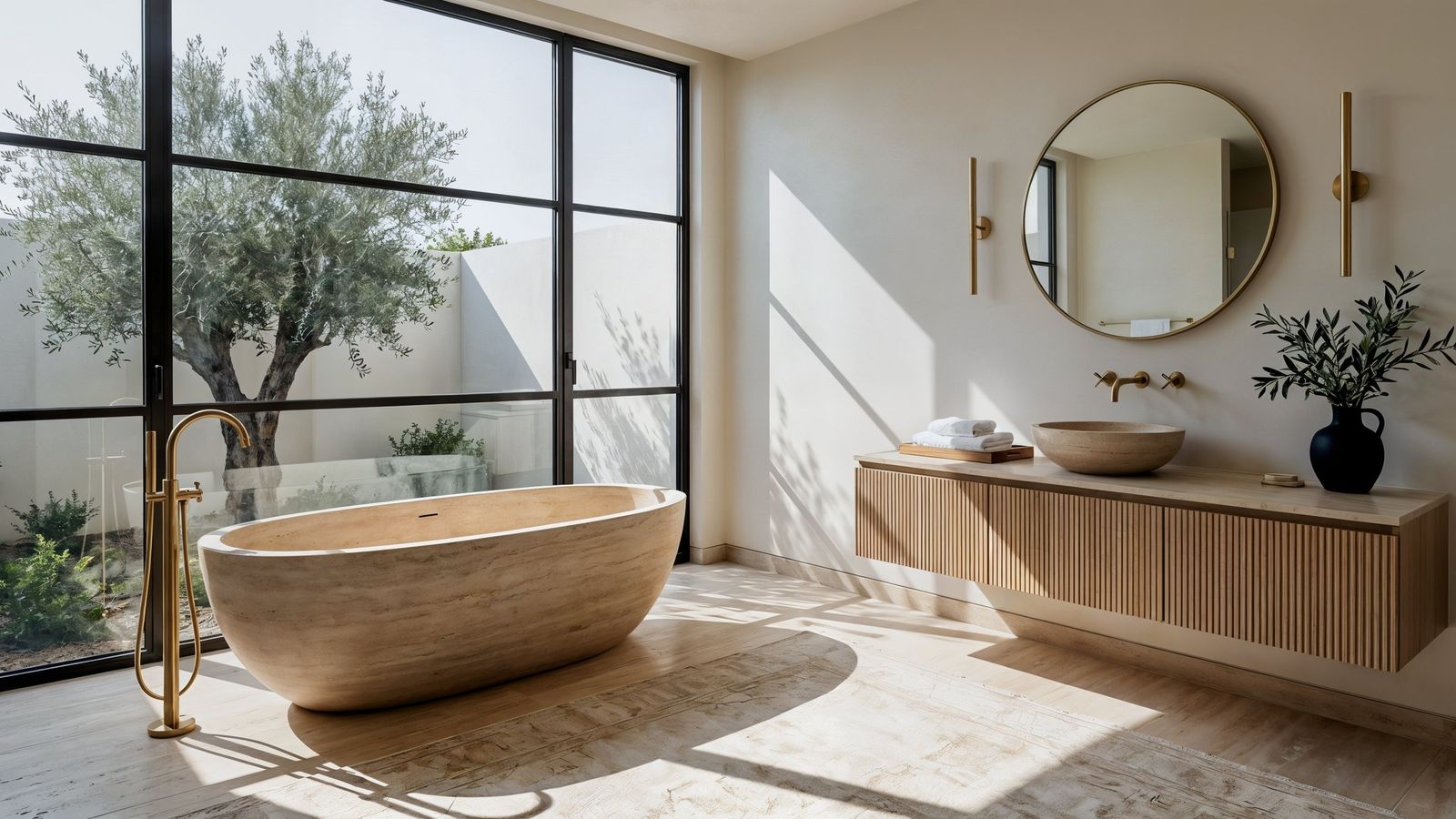
The four surfaces that make a room feel lived in
The wide shot is not what anyone remembers about a room. The four surfaces Studio Sakaia styles in every project, and the rules we keep for each one.

The rug question, answered
In an air conditioned Dubai home wool is the default, viscose is the fiber to avoid near moisture, real silk belongs in low traffic rooms, vacuums run suction only on fine rugs, and the rug should share one hue with the artwork.

The marble came last
A bathroom is designed in a fixed order: layout, joinery, taps, light, and only then the stone. Marble rewards a room that already works; it cannot rescue one that does not.

One soft line
In a home built from right angles, one curved move per room, an arched doorway, an arched window, a niche, a rounded profile, gives the eye a place to rest. The discipline is a single curve with everything else kept straight.

What listing styling includes
A scoped, one-week service for sellers and brokers ahead of Dubai's September viewing season: a furnishing plan matched to the buyer profile, install and styling inside one week, and a photographer-ready handover.

The order of operations
Most renovation overruns trace back to sequence more than to material cost: waterproofing before tile, tile set out from the entry sightline, joinery built to the tiled wall, styling last. Listing styling runs the same discipline without the construction stages, so it moves in days.

Five decisions that sell a listing
A listing that photographs well and moves fast comes down to five repeatable decisions: art sized to the furniture, decided material transitions, one composed entry surface, layered light over a single ceiling fixture, and the one room a specific buyer profile will shortlist by.

Designing for the body
Years of practising and teaching yoga made the founder attuned to what rooms do to the people inside them; light, proportion, and material register in the body before the eye consciously notices.

The Elements of a Restful Bedroom
Why some bedrooms lower your shoulders the moment you walk in, and how we build that on purpose.

The room divider that started as a row of studs
The best way to divide a room is often not a wall, and the photographs in this piece are the proof from our own home. A slatted timber screen zones a space the way a wall does, but it lets light and air keep moving, which is the difference between a bedroom that gained a dressing area and a bedroom that lost half its daylight. This one began in March as a row of bare studs, and by August it was the piece the whole room organises around.

A bathroom transformation, in three honest stages
Every bathroom renovation passes through three stages, and only two of them ever get photographed. There is the before, which people show to justify the project, and the after, which people show to celebrate it. The middle, the weeks where the room is a shell of pipework and dust and half-laid tile, is the stage nobody frames, and it is where every decision that makes the after possible actually happens. This is one bathroom from our own home, photographed through all three, because the middle deserves the record.

The brass line between oak and marble
Where two floors meet is where the quality of a renovation shows, and the junction almost nobody plans is the one everybody's eye lands on. The photograph this piece is built around is a few centimetres wide: a solid brass bar set flush between a herringbone oak floor and the marble of a bathroom, from our own renovation. It is the smallest detail in the house and the one guests bend down to look at, because a resolved junction communicates care in a way whole rooms of good material cannot.

Engineered oak, and why we chose it for our own floor
For a wood floor in Dubai, engineered oak is the honest answer, and we chose it for our own home for the same reasons we specify it for clients. Engineered boards are real oak where it matters, a solid oak wear layer on top, bonded to a stable plywood core beneath, and that construction is not a compromise on solid wood; in this climate it is the correction of it. The photographs in this piece run from the October day the first boards went down to the finished rooms months later, including the stage nobody shows, where a finished floor sits under the dust of a renovation still happening above it.

Zellige in the shower, and what handmade-look tile asks of you
Zellige is the tile that refuses to sit flat, and that refusal is the entire reason to choose it. Each square catches the light at a slightly different angle, so a wall of them shimmers instead of gleaming, alive in a way a rectified porcelain wall can never be. In our own shower we used Marazzi's Gesso, a zellige-look tile that carries that hand-made irregularity in a body built for a wet area, and the photographs here run from the bare drain rough-in one August to the finished floor with its brass strip the following spring. The tile is the star of the room, and it is also the most demanding thing in it, which is the part worth writing down.

Why we love an arch
A home is built almost entirely of right angles, and a single curve changes how all of them feel. This is the quiet reason we keep returning to the arch: not as a style or a trend, but because one considered curve does something to a room that no amount of straight-line detailing can. It softens. A doorway, a niche, a mirror, a shower recess, given an arch instead of a corner, stops being a functional opening and becomes the thing the eye rests on. We love the arch because it is the most economical gesture in design: the smallest change, the largest effect.

The shower niche, planned like joinery
The most-used shelf in a home is the one cut into the shower wall, and it is also the one that cannot be added later. A shower niche looks like a detail, a recess for the bottles, and it is actually a small piece of architecture that has to exist in the wall build-up, inside the waterproofing, and in the tile setting-out before the first tile is fixed. The arched niche in the hero photograph is from our own renovation, and the earlier photographs in this piece show what it looked like months before it was beautiful: a framed recess in a rough wall, planned like joinery, because that is what it is.

Two whites, and a windowless bathroom
The white that won our bathroom was Simply White at 75 percent strength, and the reason it won at 75 rather than 100 is the whole lesson of choosing whites: the room decides, not the chart. We wanted a warm white. The room was a bathroom with no window. And a warm white at full strength, in a room that never receives daylight, drifts yellow. The photograph in this piece is the decision at its most honest, two tins open on the stone counter, because the choice between whites is never really between the tins. It is between how each one behaves in the specific light of the specific room.

On scale: almost everything in your room is too small
The most common mistake in a room is not taste or budget. It is scale, and it runs in one direction: the rug too small, the art too small, the furniture too small, until the room reads as underfurnished and no one can say why.

On light: the case against the single ceiling
The single ceiling fixture is the fastest way to flatten a room, and turning it off is the fastest change you can make to how a space feels after dark. What a room needs instead is a handful of low, warm sources, pooled at seated eye level and run on a dimmer.
The hotel spine, and the life on top of it
The calm of a good boutique hotel room comes from a repeatable set of mechanics: order, a designed arrival, layered low light, uncluttered surfaces, and one material story. A residence can borrow that spine wholesale, then do the one thing a hotel cannot, which is layer real personal life on top of it.

Interior design and wellbeing: what a room does before you notice it
A home acts on the nervous system before it acts on taste, so the strongest design decisions are the ones made for measurable effects on mood, stress, focus and rest rather than for a look.

Wall art for Dubai homes, light, scale and tall walls
Art behaves differently in Dubai than it does anywhere we have worked before it. The light is stronger, the walls are often taller, and many rooms sit behind glazing that no European or American apartment has to account for. Choosing artwork for a Dubai home means starting from those three facts, not from a generic list of trends.

Choosing art for a modern home, size, placement and made to order
Most rooms do not need more furniture. They need one wall to say something. That is usually the moment a project turns: the sofa is right, the light is right, and a bare wall above it is holding the whole room back.

Made to order artwork, what it means and why it matters
"Made to order" gets used loosely enough that it is worth being precise about what it means for us, and why we built the collection this way rather than stocking finished pieces on a shelf.

Canvas, fine-art paper or photography, which medium belongs on your wall
Every wall art conversation eventually lands on the same question: canvas, paper, or a photograph. Clients ask it as though there is a single right answer. There rarely is one across the board. There is a right answer for a given room, a given piece, and a given wall, and figuring that out is really a question about how each medium behaves once it is hanging.

How artwork framing works, and what a good frame actually does
A frame is architecture for the image inside it. Like any piece of architecture, it can support the thing it holds or fight it. Most people notice a bad frame without knowing why it bothers them. This is a plain guide to what a frame is actually doing, so the next choice is a deliberate one.

Art above sofa size guide, the two-thirds rule and what it fixes
Almost every living room we walk into has the same problem, and it is never about taste. The sofa is good, the rug works. Then you look up and the wall above the sofa is either bare or carrying something too small to matter. Fixing that one wall changes how the whole room reads, and there is a simple rule behind how to do it.

Bedroom wall art that lets the room sleep
A bedroom has one job the living room does not: it has to let a person switch off. Every choice in that room, the bedding, the lighting, the artwork, should work toward that instead of against it. Living rooms can hold a bold, talkative piece. Bedrooms rarely can. This is a guide to choosing wall art for a room that needs to stay quiet.

Gallery wall or one strong piece, how to decide
Every project reaches this question eventually. There is a wall, there is a budget for art, and there is a choice: several pieces working together, or one generous piece doing the job alone. Both are right in the right place. The mistake is picking one out of habit rather than looking at the wall in front of you.

Entryway art sets the first thirty seconds of a home
Nobody remembers the whole house. They remember the first thirty seconds, and in most homes those thirty seconds happen in a hallway or an entry, in front of a console table and whatever hangs above it. That short stretch of wall carries more weight than its size suggests. Get it right and a guest feels the whole home before they have seen a single other room. Get it wrong and you spend the rest of the visit compensating.
Tonal abstract art and the case for quiet work in modern homes
Most rooms we walk into already have enough going on. A patterned rug, two or three different woods, a sculptural light fixture, cushions in four fabrics. By the time the walls come up in conversation, the room has already made its statement. What it needs from the art is not another voice in the argument. It needs something that lets the existing voices settle.

The five-star bedroom at home: designing a Dubai bedroom for rest
Of all the rooms people want to feel like a hotel, the bedroom matters most, and is the one most often got wrong. A bedroom that truly rests you is built around sleep, from the materials down to the switches.

The hotel feeling at home: bringing hospitality warmth into a Dubai interior
The hotel-at-home idea has become one of the strongest currents in Dubai property; the city now leads the world in branded residences. What people are reaching for is rarely grandeur. It is the particular calm of a good hotel room, and it can be built into a home.

What property staging costs in Dubai, and why we publish it
We publish our staging fees in full, by property type and bedroom count, so a seller knows the figure is standard and not built for them.

Designing a Villa Interior in Dubai: the decisions that set a warm, quiet room
How an interior designer in Dubai works a villa from the material out: the choices in stone, oak and plaster that make a warm minimalist interior feel calm, considered and built to last.

Art for the wall it is meant for
Most art in most homes is the wrong size, and the reason is simple: people buy the nearest standard size, and the nearest standard size is almost never the right one for the wall.

On travertine: why imperfection is the point
The voids, the fossils, the variation in grain; travertine is a material that records time. We use it precisely because it refuses to be perfect.
The edit: why the hardest decision is what to leave out
Every project reaches a point where restraint becomes the primary act of design. What stays in the room defines the space far less than what doesn't.
The developer handover, and the first things to change
A new Dubai apartment is finished for a brochure, not for a life. On handover it looks immaculate and photographs beautifully, and then you move in and it feels strangely hard, cool, and hotel-lobby impersonal, without it being obvious why.
The ten-day install: how we approach a market listing
Staging for a Dubai listing at the top tier of the market is a different discipline to interior design; faster, more editorial, and entirely about a specific buyer.

Aged plaster and what it takes to do it properly
Venetian plaster, tadelakt, limewash; each behaves differently and each requires a different hand. Notes from a year of working with three plasterers across two countries.

Studio 51: a brief portrait of a project
Business Bay apartment, 2025. The brief was to make a rented space feel owned, to produce calm without permanence. This is how we approached it.

Hang the curtains high and wide
Where a curtain is hung matters more than what it is made of. The single most common window mistake, in Dubai and everywhere, is a curtain hung at the top of the window frame and stopping at its edges, which makes the window look smaller, the ceiling lower, and the fabric meaner than it is.
More from the studio, in real time.
Starting a project?
Let's talk.
Tell us about your project: location, scope, timing.
Begin an inquiry →Or write directly · contact@studiosakaia.com