
When multiplicity works
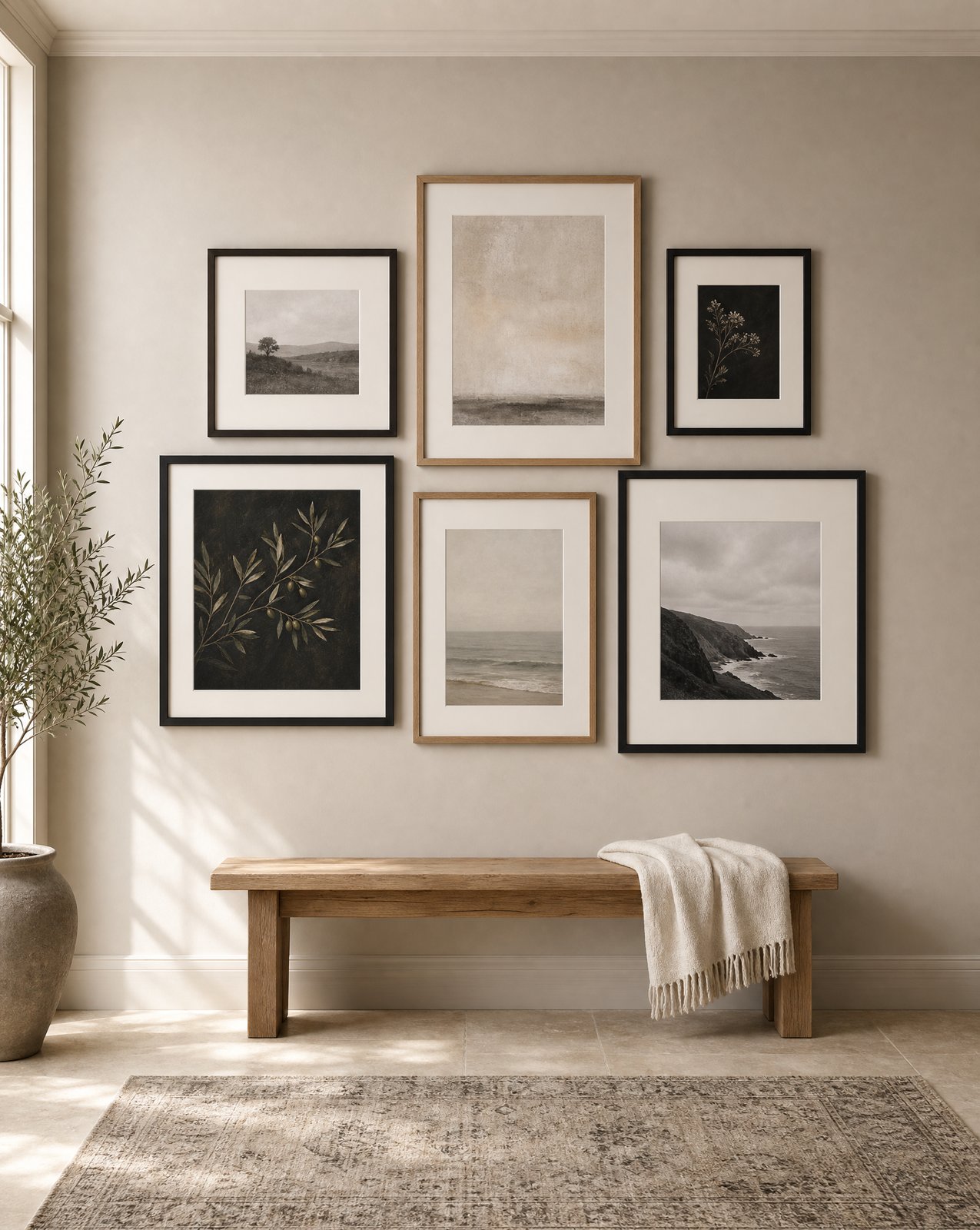
A gallery wall earns its keep when the space itself suggests repetition. Staircases are the clearest example: the eye already travels up in steps, so a run of smaller framed pieces following that line reads as considered rather than crowded. Corridors work the same way. A single piece halfway down a long hallway can look stranded, while a sequence of four or six gives the walk somewhere to look. Dubai villas, with their real double-height stairwells and long entry corridors, are where we reach for this option most often.
Collections are the other case for multiples. If you already own several pieces that share a register, the same photographer, a related palette, a common subject, hanging them together lets that relationship show. A gallery wall is at its best when it reveals a connection that was always there, not when it fills space with whatever is on hand.
The tell that a gallery wall is the right call: you can describe in one sentence what ties the pieces together. If you cannot, the wall will read as clutter no matter how carefully you hang it.
When one generous piece wins
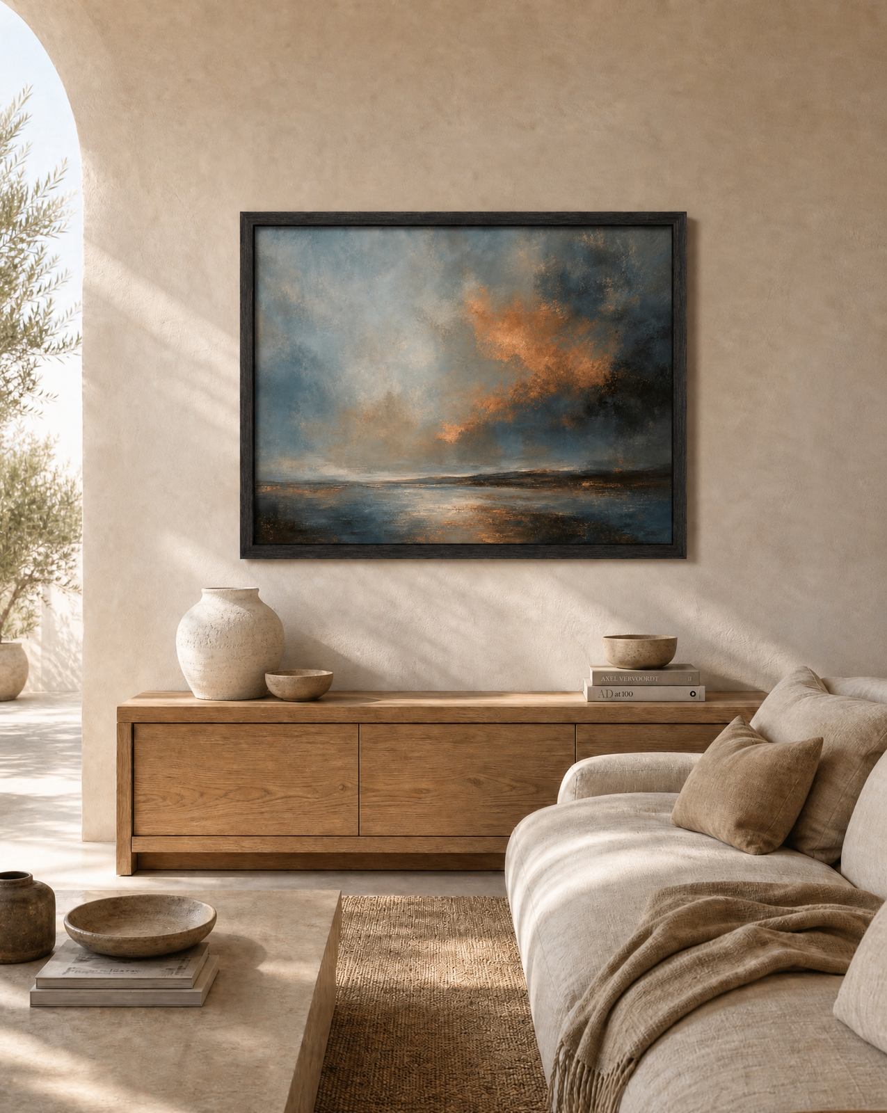
Most other walls want one piece. Above a sofa, the furniture already sets a strong horizontal line, and a single wide-format piece, or a large tonal abstract like Taupe and Charcoal Tonal Abstract, works with that line instead of breaking it into fragments. Above a bed asks for the same restraint. A headboard wants one calm anchor, not a cluster competing for attention while you are trying to sleep.
Consoles and sideboards are almost always a one-piece wall. The furniture below is already doing visual work with its own shape and shadow; adding four small frames above it doubles the busyness instead of balancing it.
Tall walls are where one piece makes the strongest case. A double-height wall, a stairwell void, the run above a bookcase, these spaces punish small art. A gallery wall scaled up to fill that height starts to look like an attempt to solve a big problem with small pieces, and it shows. One large, confident piece, something in the scale of an Amber Dusk Seascape hung generously, settles the wall in a way that six smaller frames cannot. This is a genuinely Dubai problem: entry walls that soar well past the ceiling height a modest frame was designed for are common here in a way they rarely are in an older, lower-ceilinged home.
Spacing rules for gallery walls
If you have decided a gallery wall is right, the spacing is what separates a considered wall from a scattered one.
Keep the gap between frames consistent, somewhere between five and eight centimetres depending on frame width. Wider gaps read as separate pieces that happen to share a wall; tighter gaps than that start to look accidental, as though something is missing between them.
Establish one shared line and hang every piece against it. The simplest version is aligning all the centres at a single eye-level height, roughly 145 to 150 centimetres from the floor to the centre of the grouping. On a staircase, that becomes a diagonal line following the pitch of the stairs rather than a horizontal one.
Lay the arrangement out on the floor first, always. Tape the wall dimensions out if you need to. Every gallery wall that looks effortless on the wall was worked out on paper or floor beforehand.
The maturity argument for fewer, bigger pieces
There is a pattern we see across finished projects: rooms that started with several small pieces tend to get edited down over time, and rooms with one strong piece rarely get more added. That is not a coincidence. A single generous piece reads as a decision. A wall filled with several smaller ones, chosen at different times for different reasons, often reads as accumulation rather than intention, even when every individual piece is good.
This is not an argument against gallery walls. It is an argument for choosing the number of pieces on purpose, at the start, rather than letting a wall fill up gradually. A room with one large piece and a lot of quiet wall around it tends to look considered years later, in a way that a wall of six unrelated small frames rarely does.
Mixing media
Within a gallery wall, mixing media is one of the easiest ways to keep a grouping from feeling flat. A black-and-white photograph next to a tonal abstract, a landscape beside a botanical study, works as long as the palette holds together across the group. Frame consistency does more of that work than people expect: keep the framing similar across the wall, even when the subjects vary, and the mix reads as deliberate rather than mismatched.
The same logic applies in reverse on a one-piece wall. Because there is only one work carrying the whole wall, its palette needs to sit comfortably with everything already in the room, the rug, the upholstery, the joinery. There is nowhere for a wrong note to hide.
Which wall are you standing in front of
Look at the wall itself before deciding. A staircase, a corridor, or a real collection points toward a gallery wall, laid out with consistent spacing and one shared line. A sofa, a bed, a console, or a tall open wall almost always wants one generous piece instead.
Browse the full collection at studiosakaia.com/artwork, or get in touch and describe the wall. If you are working with a design partner already, our trade programme covers exactly this kind of decision for every wall in a project.