
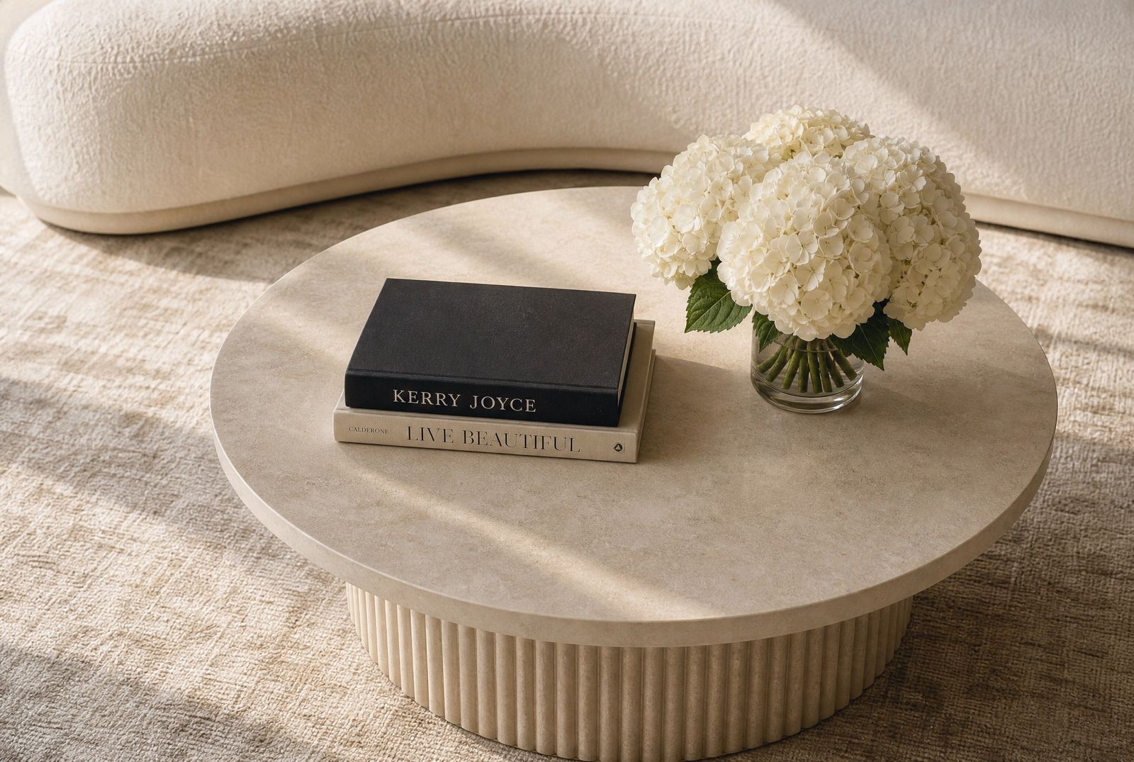
Ask someone to describe a room they loved and they will not give you the floor plan. They will give you one small part of it. The lamp beside the bed. The bowl of fruit on the counter. A stack of books someone actually finished. The wide shot tells you the room works. The close-up tells you somebody lives there.
We build these on purpose, and we build more of them than people expect. A room can be correct in every dimension, the sofa the right length, the rug the right size, the lighting properly layered, and still read as unoccupied. The fix is almost never more furniture. It is four or five small arrangements placed where the eye already stops: the console you pass on the way in, the coffee table you look down at, the nightstand at eye level from the pillow, the stretch of counter you stand at while the kettle boils.
We call them vignettes. Here is how we make them.
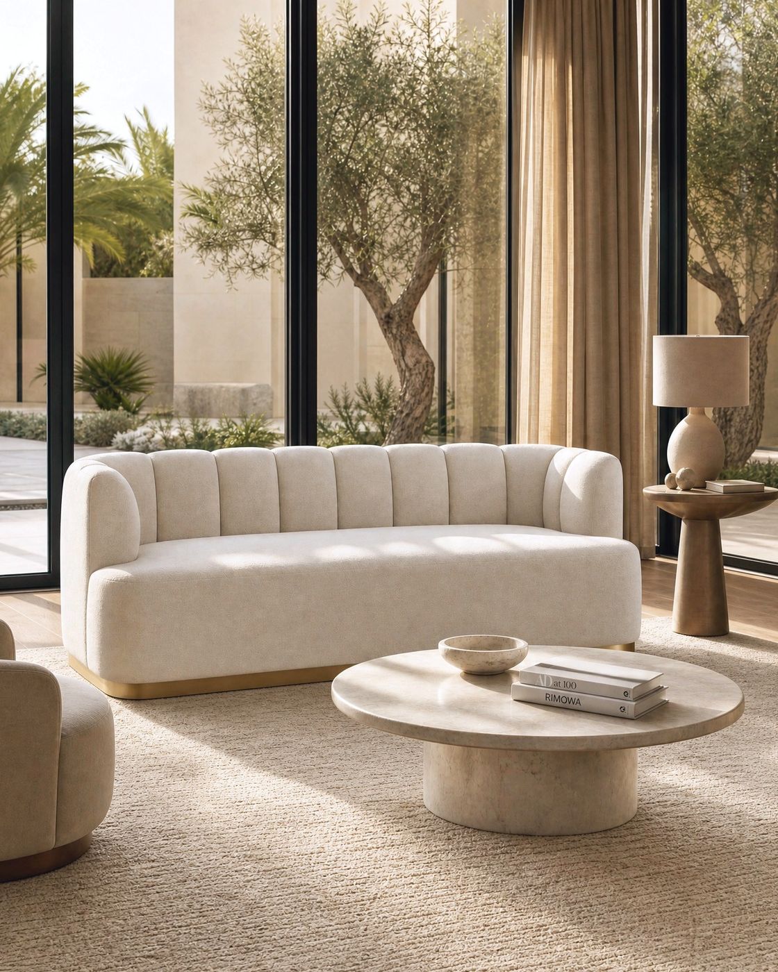

Three things, at three heights
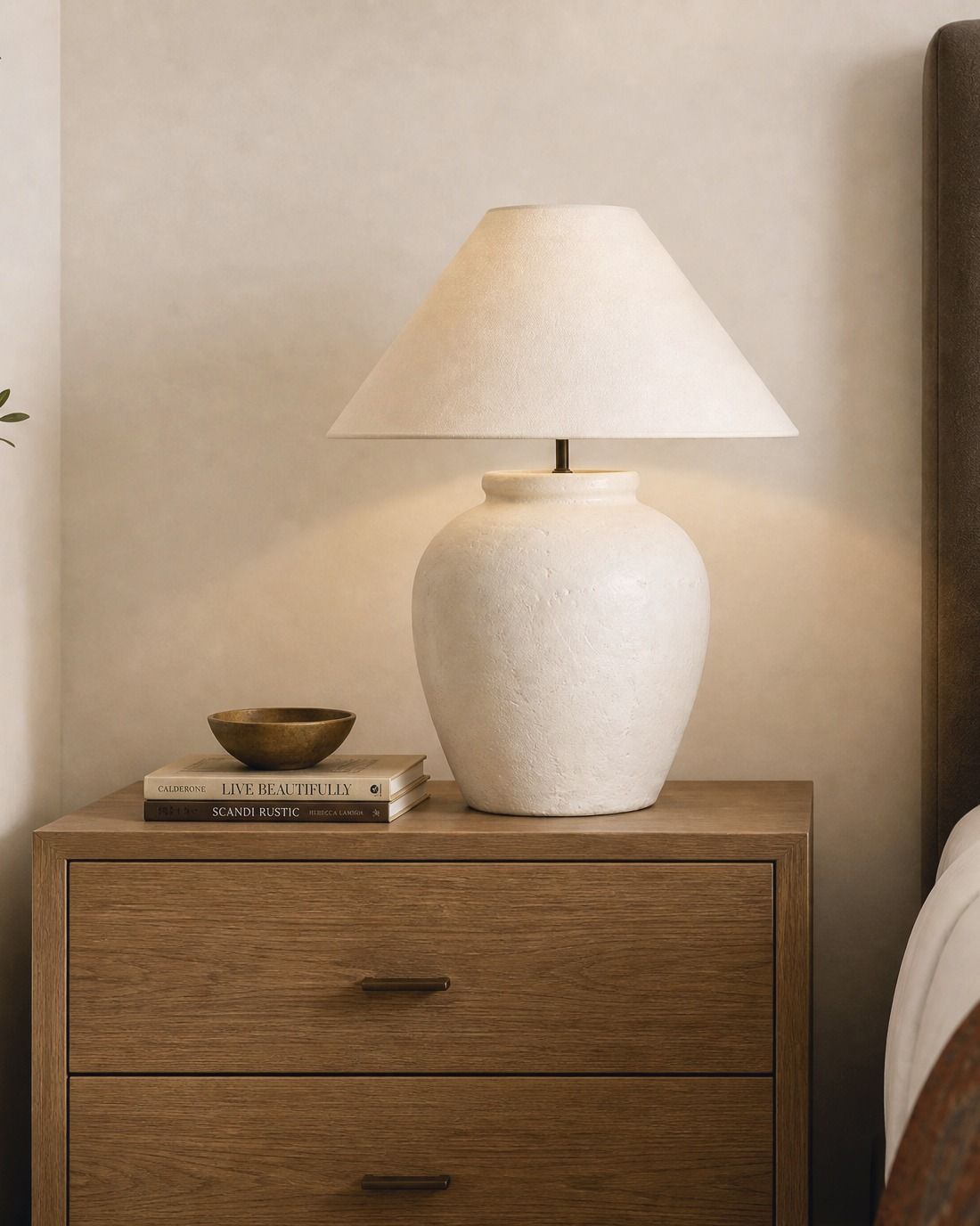
Almost every arrangement we keep comes down to three objects at three different heights, and almost every one we throw away has two objects at the same height. The eye needs somewhere to climb. On a nightstand that is usually a lamp, a low stack of books, and one small thing with a lip to it, a dish or a shallow bowl. On a console it might be a tall vase, a horizontal stack, and one low object with visible weight.
Four objects can work. Five becomes a collection, and a collection needs its own logic to hold together. Three is the number that reads as considered without reading as arranged for a photograph.
One loose, living thing
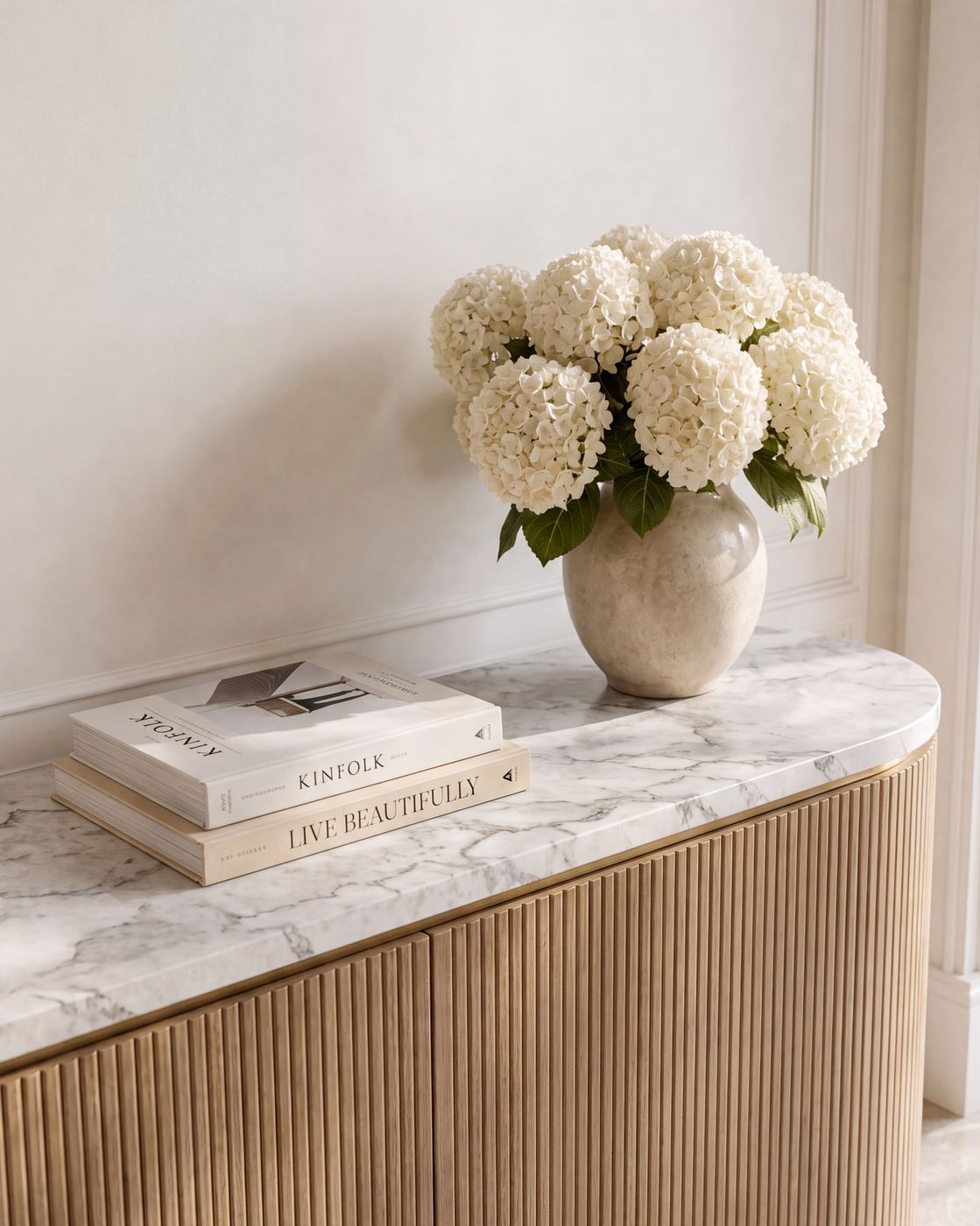
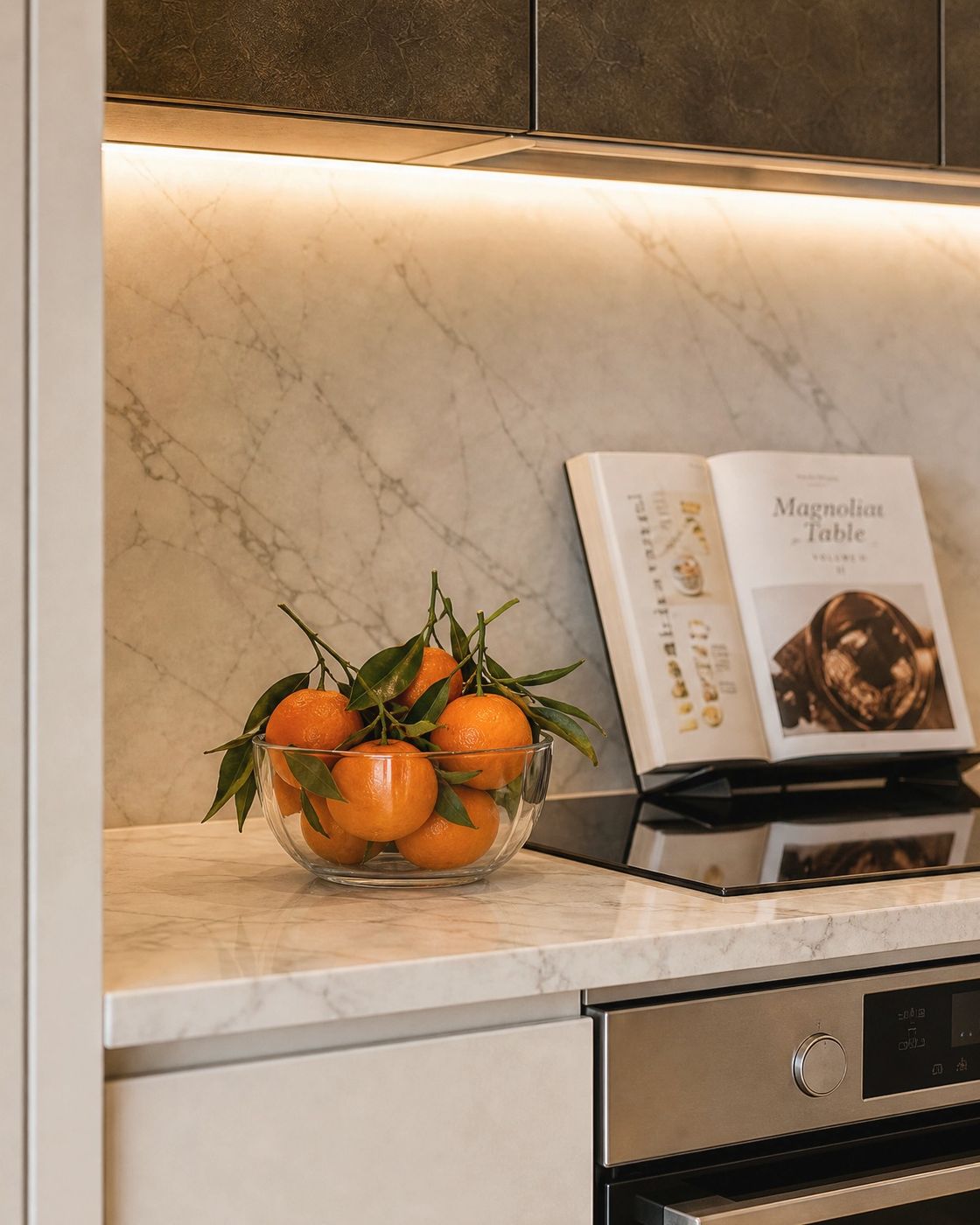
Every vignette we sign off on has one element that is not hard: hydrangeas a day past their best, a cut branch, a bowl of clementines with the leaves still attached. It is the only part of the arrangement that will look different next week, and it is the part that makes everything around it look chosen rather than delivered.
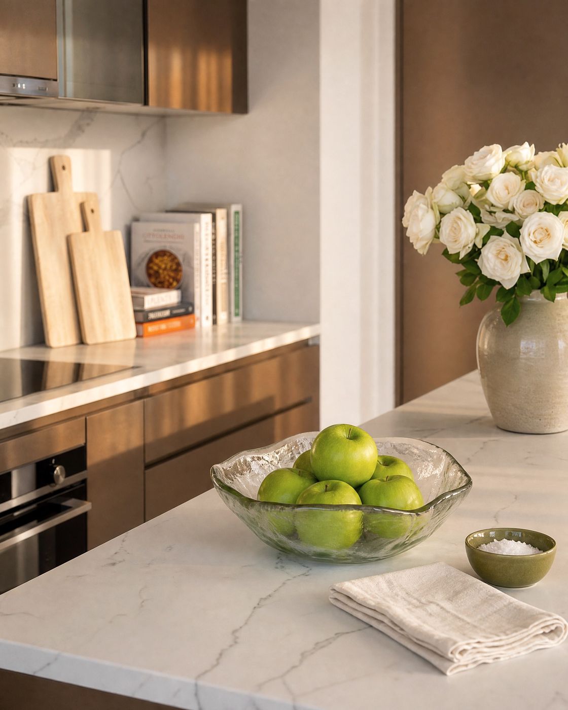
This is also why we are relaxed about fruit in a kitchen. A glass bowl of green apples on the island is not a placeholder for a real decision. It is the decision. It carries the one colour nothing else in that room is allowed to carry, it costs almost nothing, and it earns its place by being eaten and replaced.
Leave half the surface empty
The most common correction we make on a first styling pass is subtraction. A console that is sixty percent bare looks intentional. A console that is twenty percent bare looks like storage. Push the whole arrangement toward one end, let it breathe against the wall or the window, and allow the rest of the surface to do nothing at all. The empty part is what tells you the objects were placed rather than accumulated.
Borrow the room's materials, do not add new ones
A vignette should repeat what is already in the room. If the space runs on oak, marble and warm white, the arrangement runs on oak, marble and warm white, in different proportions and at a smaller scale. The vase can sit in the same stone family as the counter. A brass dish can answer the cabinet hardware. The moment a vignette introduces a fourth material it stops belonging to the room and starts looking like a gift someone left behind.
Scale it against what stands behind it
The single most useful measurement in styling is the relationship between the tallest object and the thing behind it. A bedside lamp wants to land somewhere near two thirds the height of the headboard, so it reads as part of the bed rather than in competition with it. A vase on a console works against the artwork or the wall above it, not against the console. Get that ratio right and the rest of the arrangement tends to fall into place. Get it wrong and no amount of restyling underneath will rescue it.
The crop test
Here is how we check our own work. Photograph the vignette, then crop the room out of the frame entirely. If what is left still holds, with no context and nothing around it to explain the choices, the vignette is finished. If it collapses without the rest of the room propping it up, something in it is decorative rather than decided, and it goes.
It is a hard test and most first attempts fail it. But it is the reason a room photographs well from any distance, and more importantly, the reason it still looks composed on an ordinary Tuesday when nobody is photographing anything.
Start with the four surfaces you actually use. Three objects, three heights, one of them alive, and half the surface left alone.
All frames here are design studies from projects we are working on now.