
The question I hear most often about bedrooms is whether the palette should be warm or cool. The honest answer is that calm is the goal and temperature is a preference. The two rooms in this piece run on the same foundations: warm white walls, crisp white bedding, natural texture. One leans warm, one leans cool, and both are restful. What follows is what actually decides the feeling.
What temperature actually does
Every color leans somewhere. Warm undertones read enveloping and soft, like late afternoon. Cool undertones read fresh and quiet, like early morning. Neither one owns calm. What breaks calm is saturation: colors that shout, contrast that fights across the room. Keep a palette soft and a little dusty and it stays serene in either direction.
The warm room
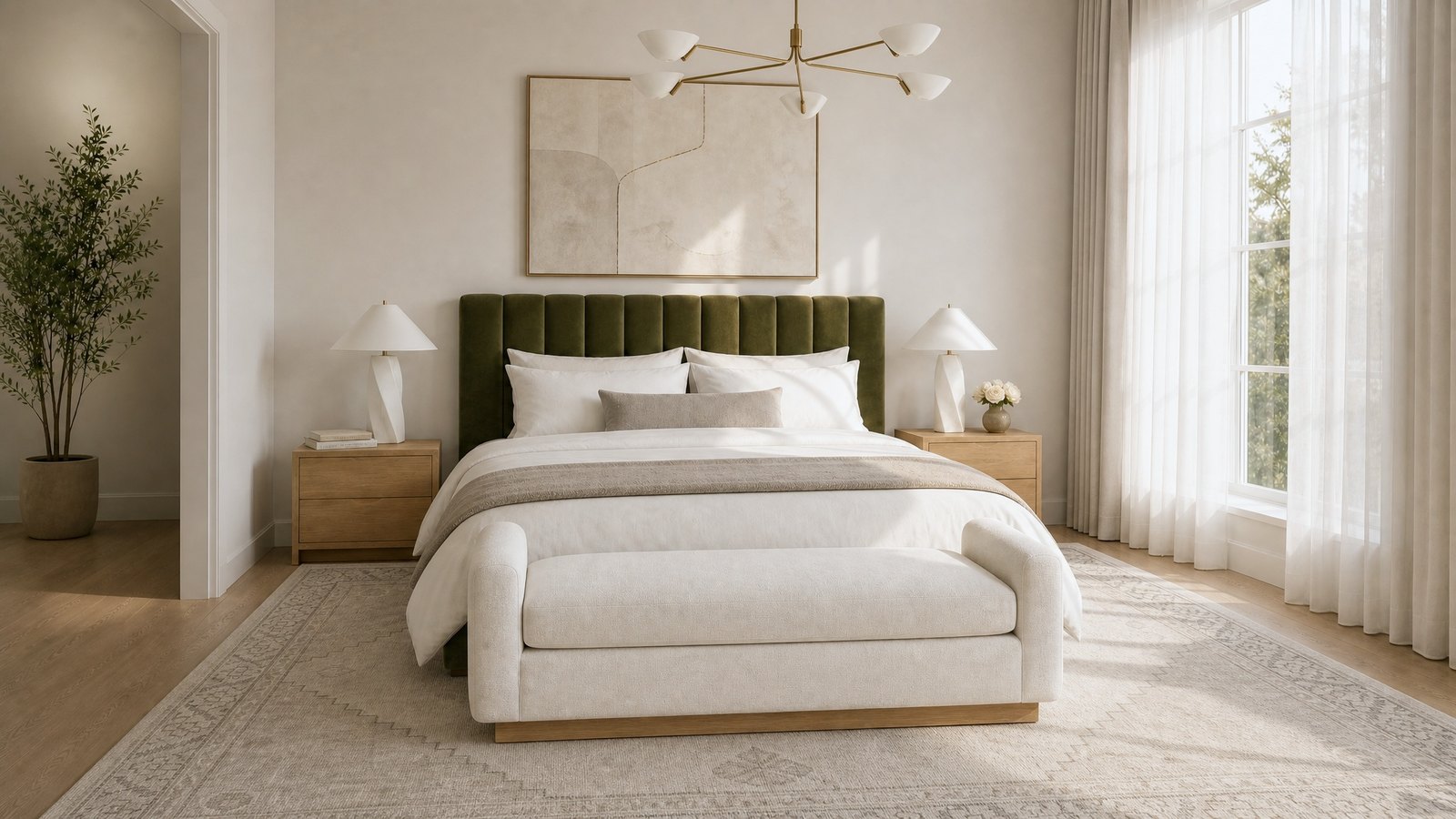
The room at the top of this page leans warm. An olive velvet headboard carries the depth, brass catches the light, and the lamps and linens sit in the same soft register. Notice where the warmth actually lives: in the objects and the textiles. The walls stay warm white and the bedding stays crisp, so the room reads warm without ever turning heavy.
The cool room
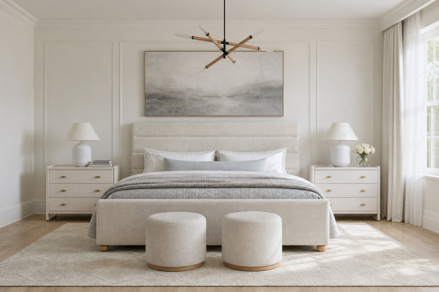
This one leans cool: greyer tones, cooler light, the same white base. Three things keep a cool palette from turning cold. Saturation stays dusty rather than icy. Texture stays natural, linen and stone and pale wood, so the surfaces feel quiet instead of slick. And the light you switch on at night runs warm: 2700 to 3000 Kelvin is a helpful reference, though your eyes will always tell you. A cool palette under warm evening light is one of the calmest combinations I know.
Choosing yours
Start with the light the room already gets, because orientation decides more than any swatch: rooms that get golden afternoon sun flatter warm palettes, and rooms with bright northern light carry cool ones beautifully. Then follow your own lean. Mine is warm, and some of the calmest bedrooms we have designed lean cool. Both are beautiful, and neither needs defending.
The white base is the constant. The bedding stays crisp hotel white in either room, the walls stay warm white, and the temperature lives in the accents: the headboard, the throw, the art, the bulbs. Which means the choice is never final, and changing your mind costs a weekend rather than a renovation.
The rooms shown are Sakaia visualisations: our design concepts, rendered to teach, not photographs of a completed project.