
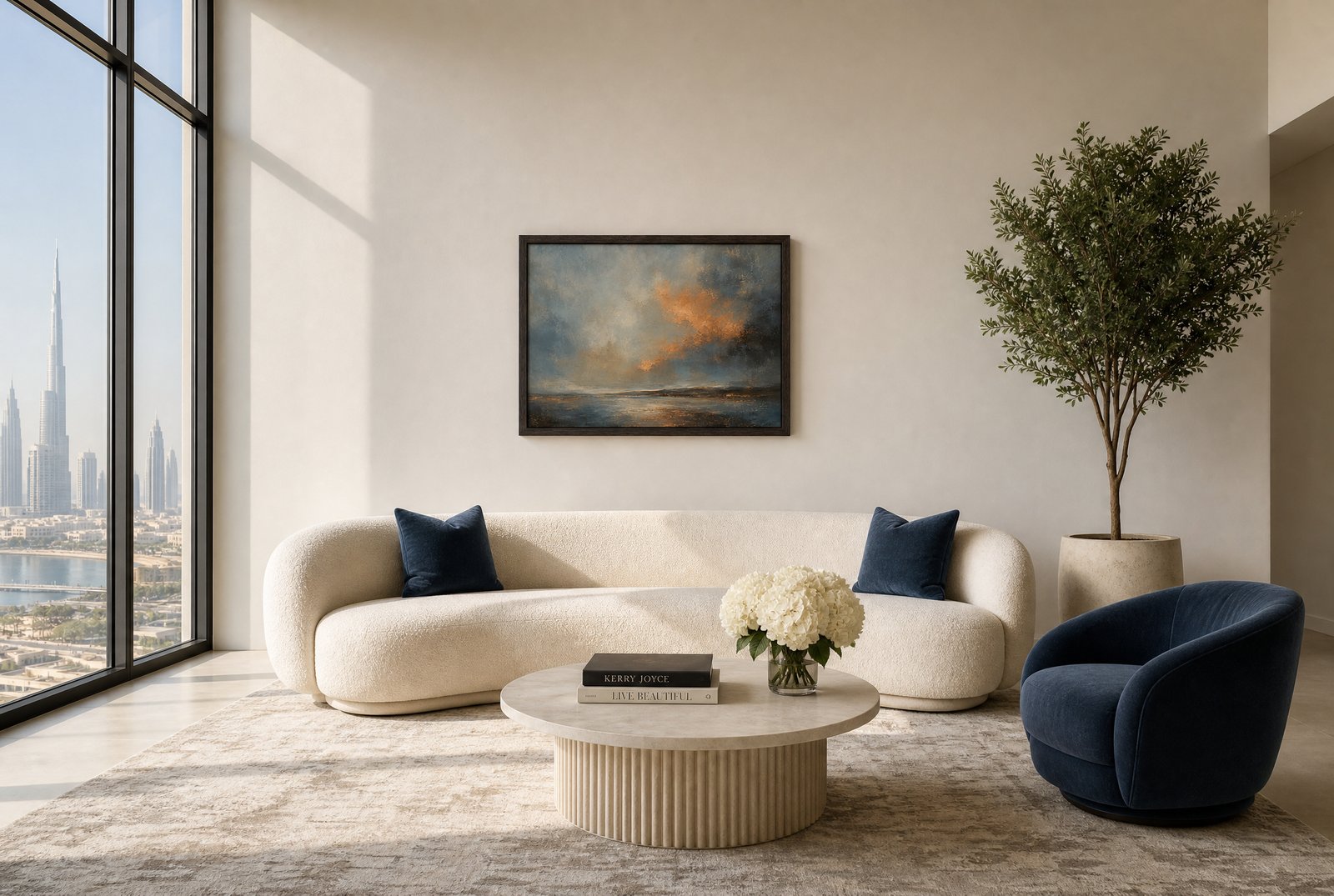
This is a short, practical guide to choosing artwork for a modern home, the way we do it in our own projects, and a note on why we built our collection made to order.
Size first, subject second
The most common mistake with wall art is not taste. It is scale. A small frame on a large wall reads as hesitation, and no subject can rescue it.
Two rules cover most rooms. Above a sofa or a console, the artwork or grouping should span roughly two thirds of the furniture width below it. On an open wall, one generous piece hung with its centre at eye level will do more than four small ones scattered around it.
When in doubt, go one size up. A larger piece with a calm subject is quieter than a small piece with a loud one.
The three walls that matter most
Above the sofa. This is the anchor wall in most living rooms. A landscape or a tonal abstract in a wide format works with the horizontal line of the seating rather than against it. Our Amber Dusk Seascape is built for exactly this kind of wall, a wide, warm horizon that holds its own above a large sofa without shouting.
Above the bed. The bedroom asks for restraint: soft tonal work, nothing that argues with sleep. A single piece centred over the headboard, or a pair hung as one unit, keeps the symmetry a bedroom wants.
The entry. The first wall you see when the door opens sets the tone for the whole home. A console, one lamp, fresh flowers and one confident piece of art will do more for arrival than any amount of styling.
Match the art to the room's palette, not its theme
A coastal room does not need a boat. A Dubai apartment does not need a skyline. The stronger move is tonal: pick up two or three colours already living in the room, in the rug, the wood, the stone, and let the artwork carry them in a different register. That is why tonal abstracts, quiet landscapes and black-and-white photography sit so comfortably in modern interiors. They join the palette instead of adding a new one.
Why made to order
Every piece in our collection is printed and framed when you order it, in the size that suits your wall. Nothing sits in a warehouse. That has two consequences we care about.
First, fit. The same work is available in sizes from a reading-corner scale up to formats built for double-height walls, so the two-thirds rule is actually achievable rather than approximate.
Second, intention. A made-to-order piece arrives because someone chose it for a specific wall. That is the opposite of filler, and you feel the difference every time you walk past it.
How our collection is organised
The collection covers tonal abstracts, landscapes and seascapes, botanical studies, black-and-white photography, cityscapes and line drawings, each available framed, in several sizes. A small founder-selected group carries the Madalina's Edit mark: the pieces our founder would hang in her own home first.
Each piece is shown in real interiors on its product page, photographed the way we photograph our design work, so you can judge how it holds a wall before you enquire. Our full artwork collection is organised the same way, room by room, so you can browse by the wall you are actually trying to solve.
Start with one wall
If you are staring at a bare wall right now, start there. Measure the furniture beneath it, take two thirds of that width, and look for a piece in that span whose colours already live somewhere in the room.
If you are working on a full home or a client project, our trade programme covers sizing and placement across every room in the plan.
Browse the collection at studiosakaia.com/artwork, and if you are unsure between two sizes or two pieces, enquire and tell us about the wall. Advising on exactly this is what we do all day.