
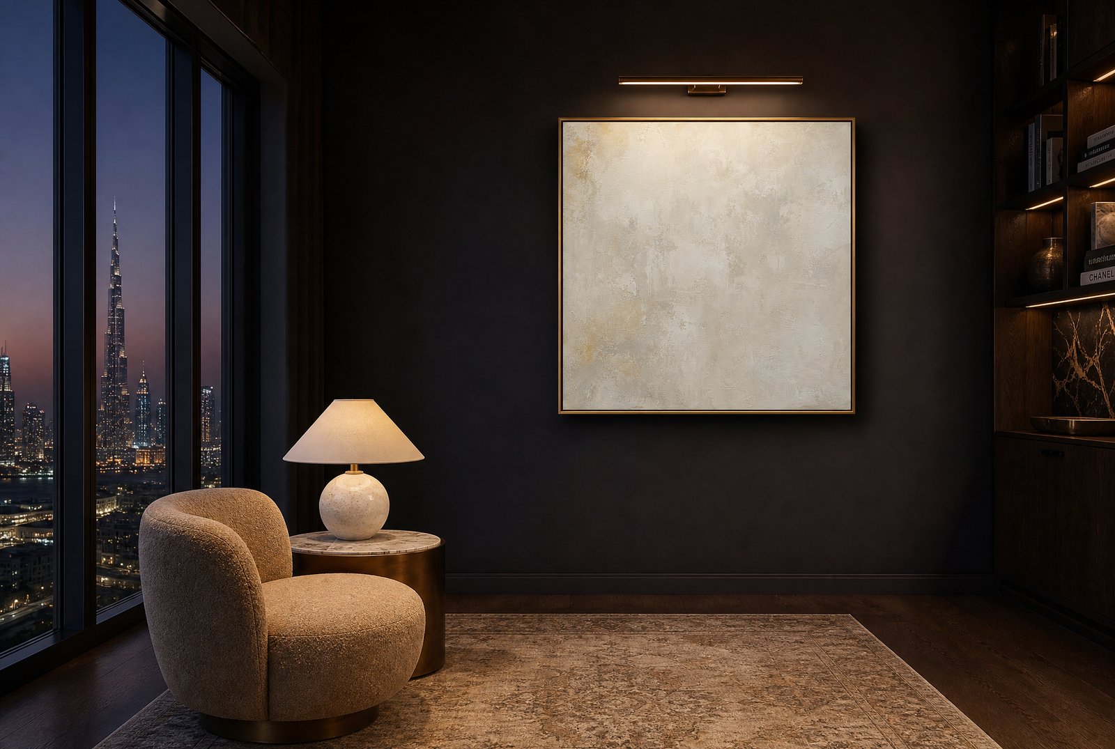
That is the case for quiet art, and specifically for tonal abstracts: work built from a narrow palette and soft gradient rather than a clear subject or a bold contrast. It is a case we make often in Dubai, where a typical apartment already arrives with strong marble, brass and glazing before a single piece of furniture goes in.
Joining the palette instead of adding to it
The instinct with wall art is often to add something: a new color, a new texture, a focal point that pulls the eye. In a room that is already full, that instinct backfires. Another strong color competes with the ones already in the room rather than complementing them, and the wall ends up as one more thing to process rather than a resolution.
Tonal abstract work does the opposite. Because it pulls from a narrow range, often two or three closely related tones, it can pick up colors already living in the room, the plaster on a wall, the undertone in a stone floor, the warmth in an oak console, and echo them back rather than introducing something new. The art joins the conversation the room is already having instead of starting a different one.
This is different from choosing art that matches the room's theme. A coastal room does not need another wave. A quiet abstract in the same tonal family as the existing palette works precisely because it is not trying to represent anything at all. It offers texture and light rather than a clear subject, which is what lets it sit comfortably next to a room that already has plenty of subject matter in its furniture and finishes.
Texture over statement
Quiet art tends to reward closer attention rather than demand immediate attention. A tonal abstract with real surface texture, visible brushwork, or a plaster-like finish gives the eye something to discover slowly rather than announcing itself the moment you walk in. That is a different kind of presence than a bold, graphic piece, and it suits rooms where people spend real time: living rooms, primary bedrooms, studies, places meant for lingering rather than passing through.
Our Ivory Plaster Minimal Abstract is built around exactly this quality. Its surface reads differently depending on the angle and the hour, which is the opposite of a piece designed to make its whole impression in the first glance.
Tonal work changes with the light, and that is the point
A piece built on subtle tonal shifts will look different at ten in the morning than it does at eight at night, and that is a feature rather than a flaw. Under strong daylight, the tonal range compresses and the piece reads as calm and even. Under a warm picture light in the evening, the same piece deepens, and the texture that was barely visible during the day becomes the whole story.
That range is worth using rather than fighting. A picture light angled correctly across a tonal abstract, as with the piece pictured here in an evening lounge setting, brings out exactly the texture that daylight tends to flatten. If you are hanging quiet work, plan for how it looks after dark as much as how it photographs in daylight.
Where quiet art fails
Quiet work is not the right answer everywhere, and it is worth saying plainly where it falls short. A room that genuinely needs a focal point, an otherwise plain space with no strong furniture, no interesting architecture, nothing else drawing the eye, will not be rescued by a tonal abstract. Quiet art needs something to be quiet against. Put it in a room with no existing presence and the wall simply goes blank in a different way.
The same goes for a room built around a single dramatic gesture: a strong piece of furniture, a striking light fixture, a bold rug that is meant to be the room's whole personality. In that context, quiet art in the wrong spot can actually undercut the drama rather than complementing it, because the eye keeps looking for the one thing the room is supposed to be about and finds two competing quiet moments instead of one clear one.
The test is simple. If the room already has a clear anchor, tonal work joins it well. If the room has no anchor at all, tonal work will not supply one. In that case, a piece with real presence, a stronger seascape or a graphic line drawing, does the job quiet art cannot.
Reading your own room
Stand in the room and count what is already demanding attention: patterns, strong colors, a striking piece of furniture. If the count is high, quiet art is very likely the right direction. If the count is low, that room needs something with more voice, and that is a different conversation.
This reading matters more under Dubai's light than it would elsewhere. Strong daylight through floor-to-ceiling glazing compresses a tonal palette further still, so a piece that reads as quiet in a showroom photograph can all but disappear on a bright Dubai wall unless the room around it is already doing enough work to give it something to sit against.
Browse the tonal and minimal pieces in the collection at studiosakaia.com/artwork, or enquire and describe the room. We can tell you quickly whether it wants quiet work or a stronger anchor.