
Soft tonal work over the bed
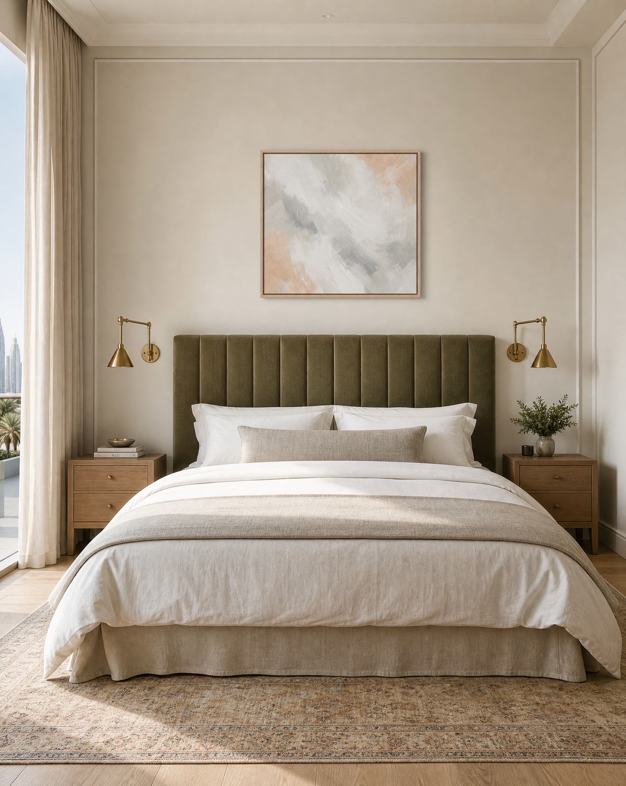
The safest and most reliable choice above a bed is soft tonal work: a gentle abstract, a muted landscape, something with no hard narrative and no sharp focal point demanding attention. The eye should be able to pass over it on the way to sleep without stopping to interpret anything. This matters most in Dubai bedrooms, which tend to run large and bright, and where good blackout and a calm wall are doing most of the work of actually letting the room rest you.
This is different from saying bedroom art has to be boring. Tone and softness are not the same as blandness. A well-made tonal abstract, in the right palette, does real work in a bedroom: it fills the wall and warms the room without raising its energy the way a busy or high-contrast piece would.
Sizing: 50 to 70 percent of the headboard width
The proportion above a bed is narrower than the rule for a sofa. Aim for the artwork, or the combined width of a pair, to span 50 to 70 percent of the headboard's width. Much wider and the piece competes with the bed for authority in the room. Much narrower and it reads as an afterthought above a piece of furniture that is usually the largest object in the space.
Height follows similar logic to a living room: leave a clear gap between the top of the headboard and the bottom of the frame, enough that the two feel related without stacking. With a tall upholstered headboard, that gap can sit toward the shorter end, since the headboard is already doing visual work of its own.
Single piece or pair, hung as one unit
Bedrooms respond well to symmetry, more so than most other rooms in the home. A single generous piece centred above the headboard is the simplest route and works particularly well with an upholstered or panelled headboard that already has a strong centre line.
A pair, hung close together so they read as one composition, is the other reliable option, especially over a wider bed or a headboard with a busier shape. Keep the gap between the two frames tight and treat their combined width as the number you measure against the 50 to 70 percent rule. Avoid an asymmetrical arrangement over a bed. It can be interesting on an open wall, but over a headboard it tends to unsettle a room that is trying to do the opposite.
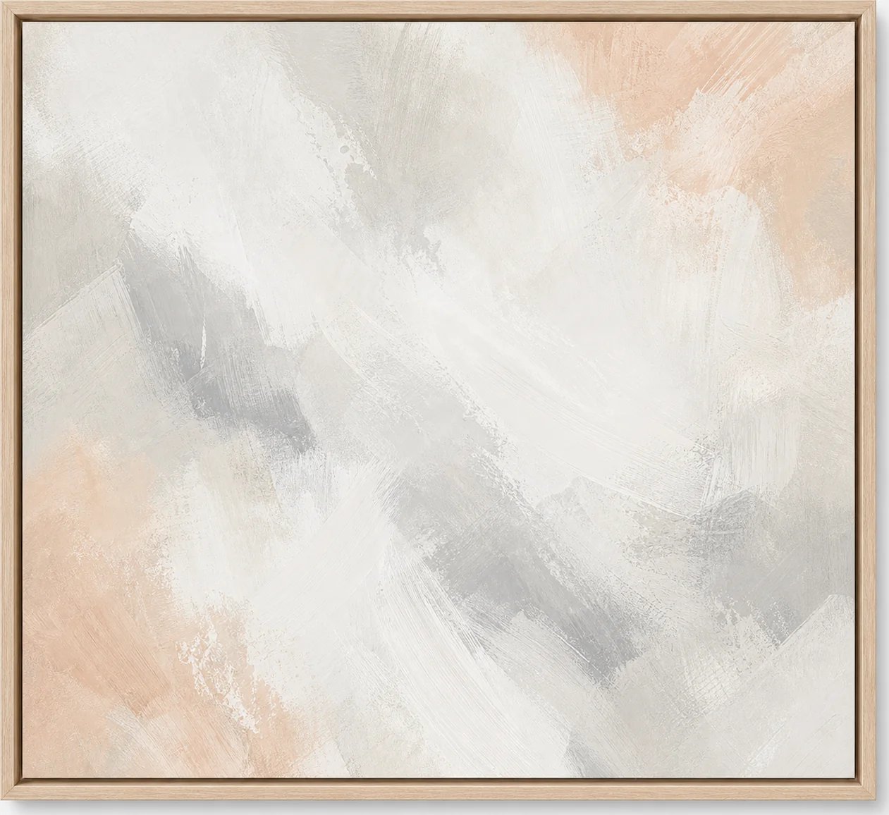
Our own Blush and Grey Soft Abstract is designed with exactly this brief in mind, a piece quiet enough to sit above a bed without adding noise to a room that should be winding down by the time anyone is looking at it.
What to avoid in a bedroom
Busy pattern. Small detail or repeating motifs ask the eye to keep working. That is the opposite of what a bedroom wall should do at ten at night.
High contrast. Stark black against white, or any piece built around sharp tonal jumps, tends to read as more awake than the rest of the room. It can look striking on a gallery wall in a hallway. Above a bed it fights the softness everything else is trying to establish.
Glass glare at night. A glazed frame positioned across from a window, a mirror, or a reading lamp will catch light after dark and throw a bright reflection back at the bed. Before committing to a spot, stand at the bed after sunset with the lamps on and check what the glass picks up. A small shift in placement, or a piece without glazing, usually solves it. This is worth checking twice in a Dubai high-rise bedroom, where the same wall can face a lit skyline through the night.
Match the palette to the bedding and the wood
The fastest way to know if a piece belongs in a bedroom is to hold it against the bedding and the visible wood tones in the room, the headboard, the nightstands, the flooring. A palette that already exists somewhere else in the room will feel inevitable rather than added. A palette that introduces a brand new colour family, however beautiful on its own, will read as a decision the room has to accommodate rather than one it already agreed to.
This is why blush, grey, sand and soft green tones do so much work in bedrooms furnished with warm woods and neutral linens. They are quiet enough to disappear into the palette while still giving the wall something worth looking at during the day.
Bringing it together
Start with the headboard width and take 50 to 70 percent of it as your target span. Choose soft tonal work over anything with sharp contrast or busy detail, check the spot for glare after dark, and match the palette to what is already in the room rather than introducing something new.
If you are furnishing more than one bedroom in a project, our trade team can help size and place art across the whole home so every room follows the same calm logic. Browse the full collection at studiosakaia.com/artwork, or enquire with your headboard width and bedding palette and we will help you find the right piece.