
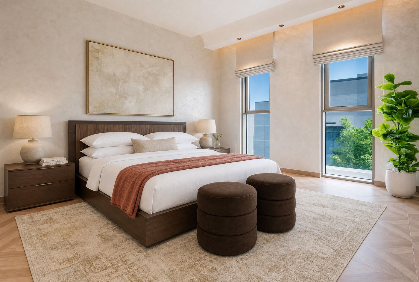
Calm is the most requested feeling in interiors and the most misunderstood one. Most people chase it by removing colour until nothing is left, and then wonder why the room feels flat instead of peaceful. Calm and flat are different things. Here's how I build palettes at my studio, and where the life comes from.
Start with temperature, then choose colours
The first decision I make has nothing to do with picking a colour from a fan deck. It's the undertone. Every white, every beige, every grey leans warm or cool, and the lean matters more than the name on the tin. I lean warm in almost everything, because warm undertones read as rest, and cool ones drift toward the feeling of an office. Once the temperature is set, every colour that enters the room gets checked against it. A single cool grey in a warm room is the kind of mistake nobody can name and everybody can feel.
The trap of the all-neutral room
Here's the thing I tell everyone who asks for a neutral home. Neutral is not the problem. Flat-neutral is. A room where every surface is a polite, soft nothing doesn't feel serene, it feels unoccupied. So every room I design carries one confident anchor: one colour or one pattern that takes a position. A moss-green headboard. A rug with real character. One armchair in a saturated or bold colour. And next to that anchor, everything else deliberately stays quiet. The calm is what lets the anchor work, and the anchor is what saves the calm from being empty.
Three ways in, if a bold colour scares you
Not everyone wants colour on the walls, and there are three routes I use to bring a neutral room to life without repainting anything. The first is the furniture: keep the envelope soft and let one seat or one cabinet carry the colour. The second is the window: when a room looks onto a garden or the sea, the view itself can be the colour anchor, and the interior stays quiet on purpose to frame it. The third is contrast of light and dark: a pale, sculptural piece against a deeper, warmer envelope. Any one of the three de-flattens a room. You only need one.
A little black
One habit I bring to nearly every project: a small amount of black. A lamp base, a slim picture frame, a door handle. Any room can handle a little bit of black, and soft palettes in particular need it, because black grounds all that gentleness the way punctuation grounds a sentence. The dose matters. Accents, never a dominant.
Keep the count low, and think beyond the room
For the main palette I hold myself to three or four colours, and I let texture do the rest of the talking. More than that and the eye starts working instead of resting. And I always think about the rooms as a sequence, because nobody experiences their home one room at a time. Colours don't have to repeat everywhere, but they have to be able to shake hands across a doorway.
One more position of mine: when a colour deserves a wall, I give it the whole room, walls and sometimes the ceiling too. A single painted accent wall tends to date fast and reads as hesitation. Wrapping the room in the colour reads as conviction, and conviction, calmly held, is what a good palette actually is.
Before you commit
Paint large samples on more than one wall, and live with them for a few days. Light changes across the day, and a colour that behaves at noon can turn on you in the evening. The patience costs a week. The wrong colour costs a repaint, and worse, a room you never quite trust.