
This is the first entry in our Artwork 101 series, and it covers the three medium choices we get asked about most, including where each one holds up under the strong daylight most Dubai homes get for much of the year.
Gallery-wrapped canvas: presence over precision
Canvas is the medium for painterly work and for scale. The texture of the weave picks up light unevenly across the surface, which is exactly what a painterly landscape or a loose abstract wants. It softens brushwork rather than sharpening it, and at large formats that softness reads as presence rather than blur.
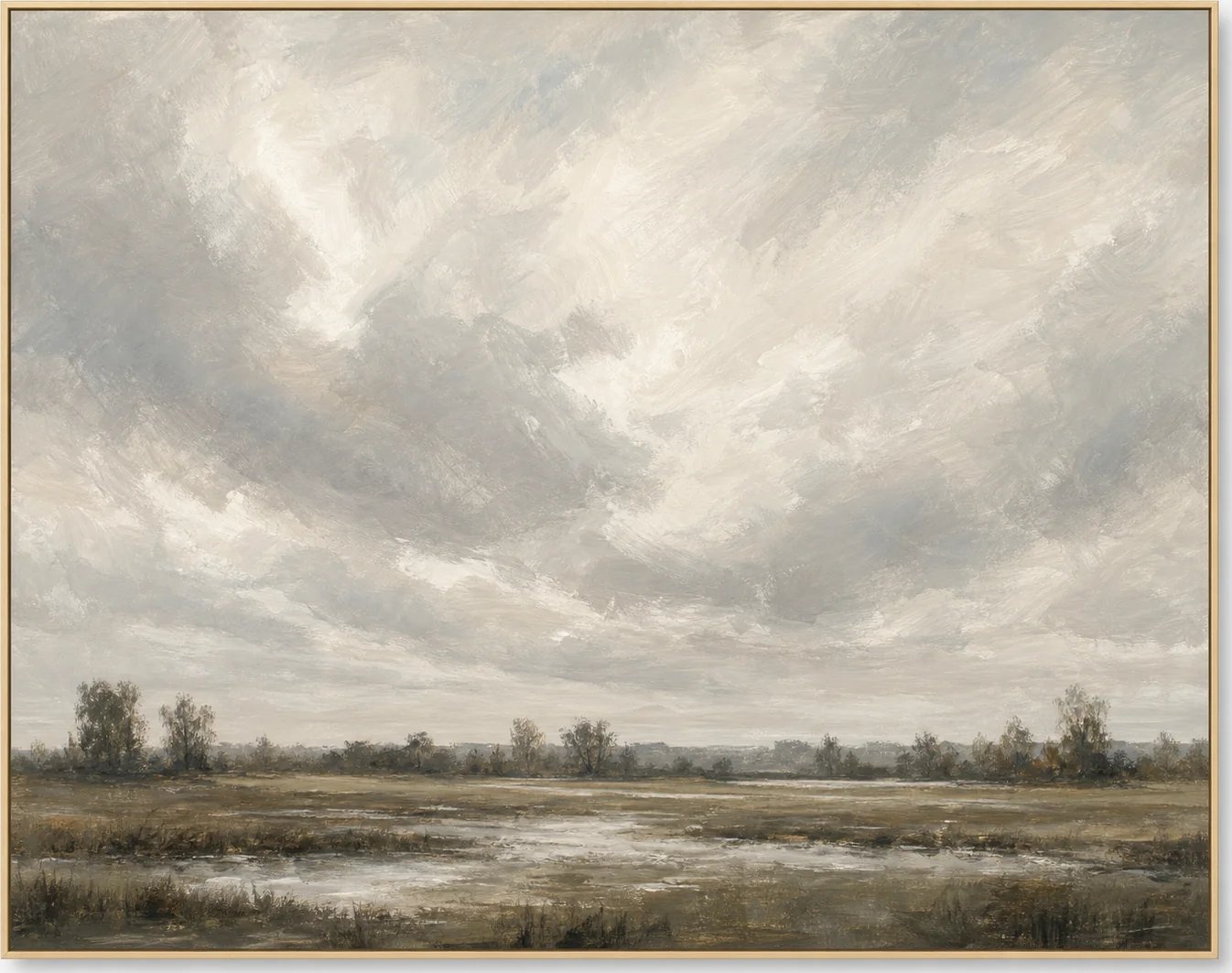
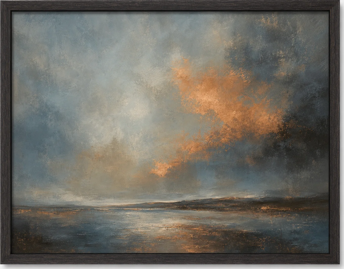
Gallery wrap, where the canvas continues around the edges of a deep stretcher bar, lets a piece hang with no frame at all. That is a deliberate look: modern, unfussy, and well suited to rooms that already have strong architectural lines and do not need another border competing for attention. Our Cloudy Marsh Sky works this way. Hung without a frame, the sky's tonal shifts read as continuous, almost atmospheric, rather than boxed in.
Canvas is also the forgiving choice for large-scale work. A big expanse of matte cotton paper behind glass can feel heavy and formal. The same size in canvas feels lighter, because there is no glazing to catch reflections and no visible frame edge to draw a hard line around it.
Matte cotton paper: detail and formality
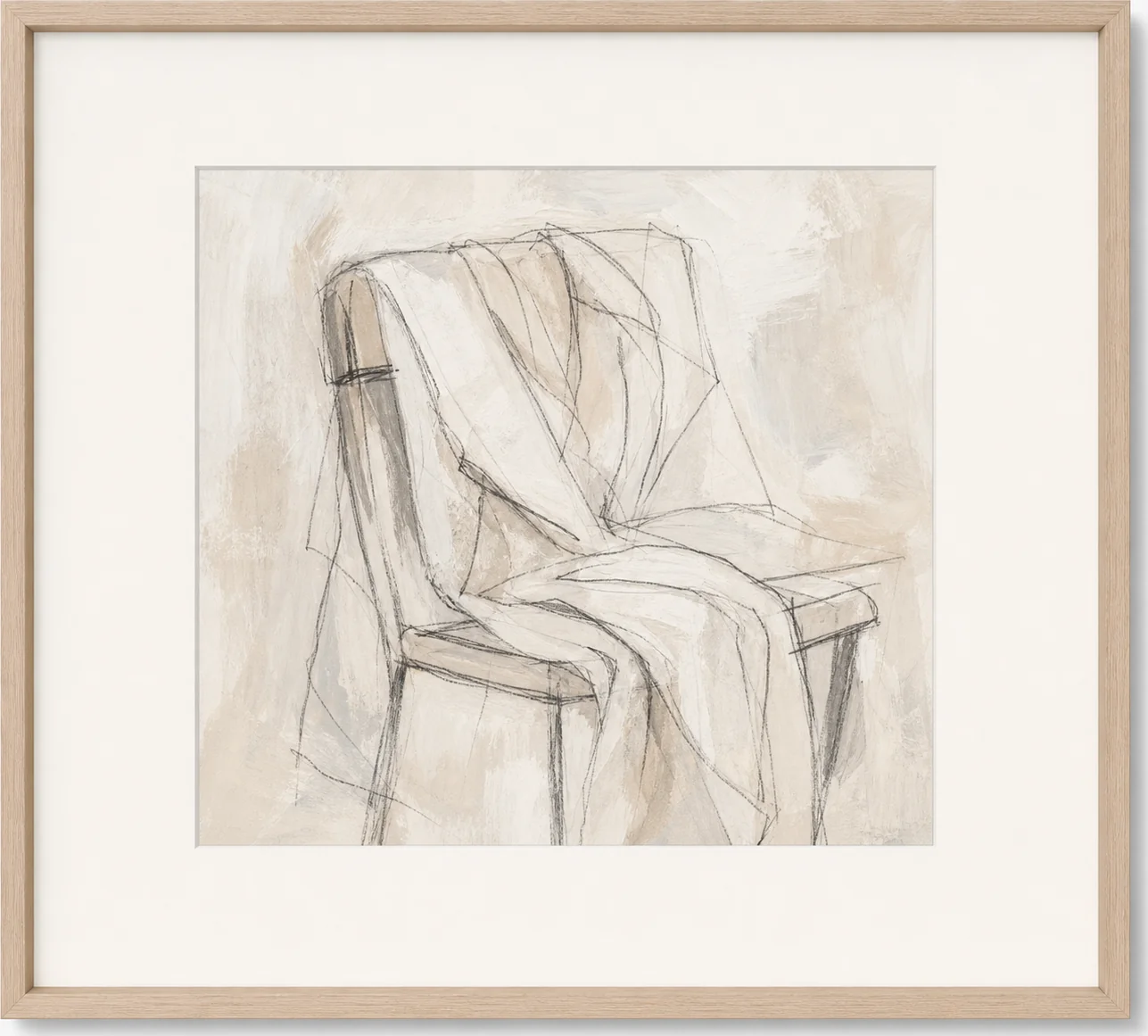
Fine-art paper is the right call when the work depends on detail, fine line, or a controlled palette that benefits from the crispness paper gives you. Botanical studies, architectural drawings, and detailed still life all read more clearly on paper than on canvas, because the surface is flat and even rather than textured.
Paper wants a frame and, in most cases, a mat. The mat does two things: it protects the paper from touching the glazing directly, and it gives the eye a resting border before the wall takes over. A wider mat reads as more formal and more considered; a narrow mat feels tighter and more contemporary. Either can be right, but the choice should be deliberate rather than default.
This is also the combination that suits smaller, more intimate pieces. A paper print with a generous mat in a slim frame holds its own on a narrow wall in a way that an unframed canvas of the same size would not.
Photography: the presentation carries the image
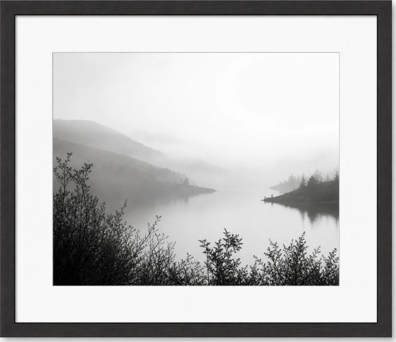
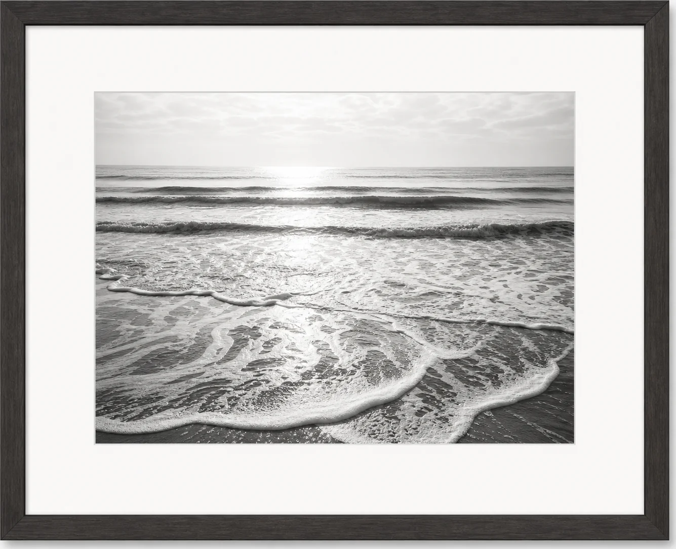
Photographic prints ask a slightly different question than paintings do, because the presentation carries as much information as the image itself. A black-and-white photograph with a wide mat and a simple frame reads as gallery work: considered, slightly formal, closer to something you would see on a museum wall than a living room wall, in the best sense.
Our Foggy Lake and Hills study is a good example of how much a wide mat does for a photograph. It gives the tonal range room to sit quietly rather than crowding the eye straight to the edge of the frame, which matters more with black-and-white work than with color, where the eye has less to hold onto besides the composition itself.
Glazing basics
Whatever the medium, if it sits behind glass, the glazing choice affects how the piece actually lives on the wall day to day. Standard glass is the least expensive option but shows the most reflection, which matters in rooms with strong window light or opposite a bright lamp. Anti-reflective glazing cuts that glare significantly and is worth the difference in a room where the art faces a window. In rooms with controlled, indirect light, standard glazing is a reasonable place to save. Given how much glazing the typical Dubai apartment or villa carries, we recommend anti-reflective as the default rather than the upgrade for anything hung opposite a window.
How to decide, room by room
A living room with strong architectural lines and a large expanse of wall usually wants canvas: big, unframed or lightly framed, tonal. A study, a reading corner, or a hallway with detailed work benefits from paper with a mat, because the smaller scale and closer viewing distance reward the crispness. A room built around a photographic mood, black-and-white or otherwise, wants the gallery treatment: wide mat, simple frame, glazing chosen with the room's light in mind.
None of these rules are absolute. They are a starting point for a decision that ultimately depends on your wall, your light, and what the piece is trying to do in the room.
Browse the full collection at studiosakaia.com/artwork to see each medium in real interiors, or enquire if you want a second opinion on which one suits your wall.