
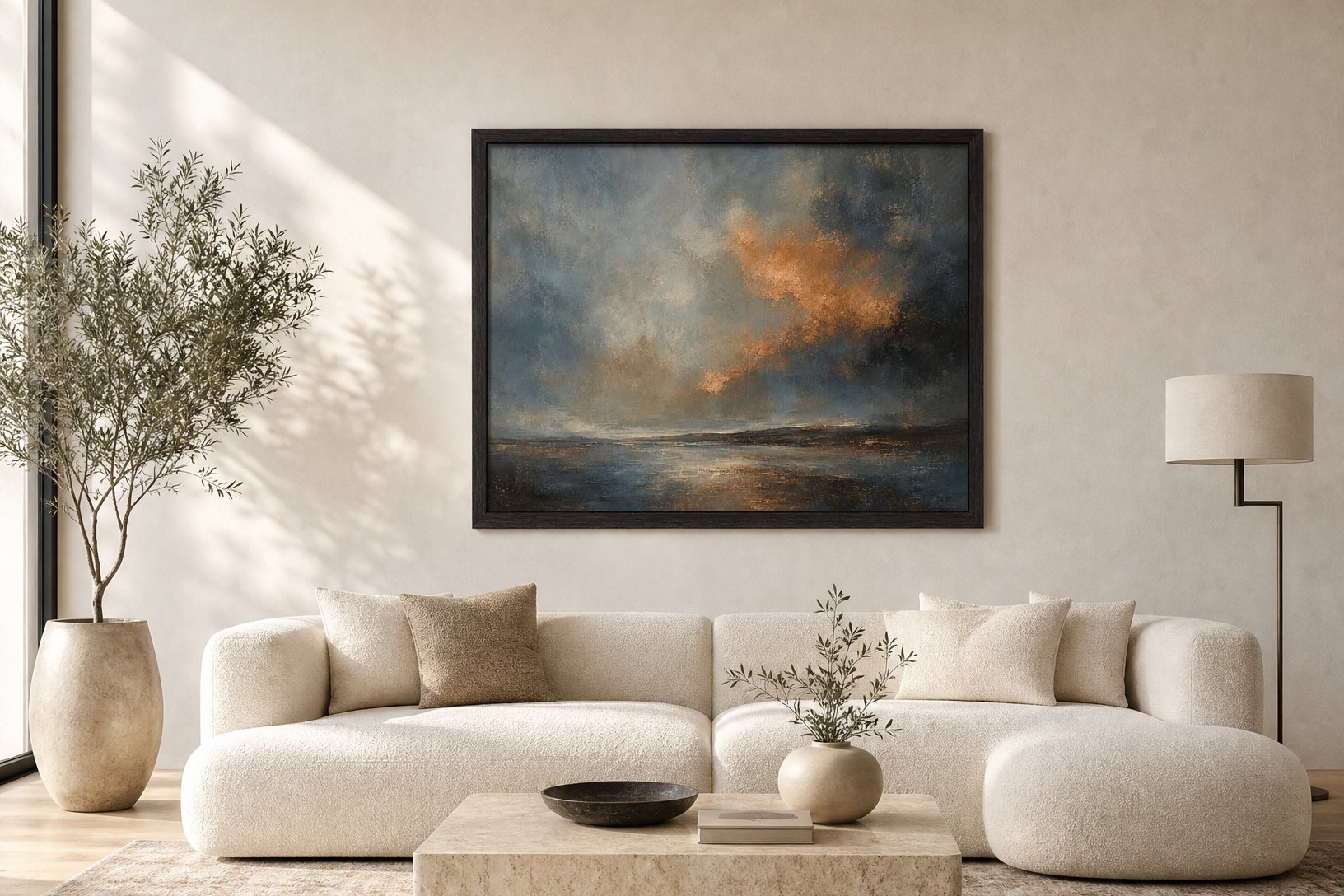
The most common mistake in a room is not colour, or taste, or budget. It is scale, and it almost always runs in one direction: the rug is too small, the art is too small, the lamp is too small, the coffee table is too small, and the room reads as underfurnished and slightly anxious without anyone being able to say why. Scale is the hardest error to see, because each piece looks fine on its own. It is only in the room, in relation to everything around it, that the smallness shows.
The reason the mistake runs one way is simple. Furniture and art look larger in a shop, a showroom, or a website photograph than they will in a room, because they are shown in isolation against a neutral ground with nothing to give them scale. A rug that fills the frame online arrives and turns out to float in the middle of the floor like an island. A painting that looked generous on screen hangs on the wall and reads as a stamp. The instinct to play safe, to choose the smaller size, the cautious size, is the instinct that produces a room full of things that are individually pleasant and collectively too small. The mistake shows up faster in Dubai than in a smaller, older room, because so many local apartments and villas hand over with generous floor plans and floor-to-ceiling glazing, and a rug or a piece of art scaled for an average room reads as undersized the moment it lands in one of these larger, brighter spaces.
The rug is the floor of the mistake
Start with the rug, because it sets the scale for everything above it and it is the piece people most often buy too small. A rug is not a mat placed in front of the sofa. It is the ground the seating group stands on, and the seating should sit on it, not around it. The working rule is that the front legs of every major piece, the sofa and the chairs, land on the rug, and better still that the whole group sits within it with a margin of rug showing beyond the furniture on every side.
In a normal living room that means a rug of three metres by two and a half, or larger, not the two by one and a half that felt safe in the shop. The margin of bare floor between the edge of the rug and the wall should be roughly even all the way around, a border that frames the room rather than a random gap. A rug too small pulls the furniture into a huddle in the centre of the floor and leaves a moat of hard floor around it, which is the single clearest signature of a room that was furnished cautiously. The rug that looks slightly too big rolled up in the room is usually the right one once the furniture is on it.
Art wants the wall, not a corner of it
The same caution shrinks the art. A single small frame on a large wall reads as an afterthought, marooned in space, and no amount of good framing rescues it. Art should occupy the wall it is on, which for a piece hung over a sofa or a console means a width of roughly two thirds to three quarters of the furniture below it. Over a two metre sofa, that is a piece or an arrangement around a metre and a half wide, not the sixty centimetre frame that felt like enough.
Height matters as much as width. The centre of a piece, or the centre of a group hung together, should land around 145 to 150 centimetres from the floor, which is average eye level, so the work meets you rather than floating above your head. The most common hanging error is too high, art creeping up the wall toward the ceiling until it addresses no one. Hung at eye level and scaled to the wall, a single generous piece does more than a scatter of small ones, and it is the reason made to order sizing matters: a piece cut to the wall it is meant for will always sit better than the nearest standard size bought to fit an idea of the space rather than its measurements.
The pieces between the large pieces
Once the large elements are scaled up, the smaller ones have to follow, or they look stranded. A coffee table in front of a three seat sofa wants to be roughly two thirds the length of the sofa, low and generous, not the small square that leaves a metre of empty floor on either side. A side table should sit at or just below the arm of the chair beside it, so a glass set down is at hand height, not somewhere near the floor. A table lamp should be tall enough that its shade reaches seated eye level, which for most side tables means a lamp taller than instinct suggests, because a short lamp on a low table throws its light into your lap and leaves the room dark above it.
The through line is that scale compounds. Under scale the rug and every choice above it inherits the smallness. Get the large pieces right, the rug, the sofa, the art, and the smaller pieces have something to measure against and tend to find their size. Get them wrong and no amount of styling on top will settle the room, because the eye keeps registering the gaps.
The clearances are part of the scale
Scale is not only the size of the objects. It is also the space between them, and the space around them, and getting the objects large enough is only half the work. A large sofa pushed hard against a wall with everything else crammed in around it is as wrong as a small one adrift in the middle. The room wants generous pieces with real clearance around them: a walkway of at least 90 centimetres through the main routes, 40 to 45 centimetres between the sofa and the coffee table so you can reach a cup without leaning, and a clear zone around each large piece rather than a wall of furniture pushed to the edges.
This is where the discipline of Aman, and specifically the rooms Kerry Hill designed for the group, is worth studying. Their calm comes from large, low, horizontal furniture given a great deal of space around it, one generous piece where most rooms would put three small ones. The scale is bigger and the count is smaller. That combination, fewer things, each one larger, with real space between them, is almost the opposite of how an under scaled room is furnished, which is many small things pushed together to fill the space. The room with fewer, larger, better spaced pieces reads as calm and considered. The room with many small ones reads as busy, whatever the quality of the individual pieces.
The test
Photograph the room on your phone and look at it small, on the screen, rather than standing in it. Scale errors that hide in person show immediately in a photograph, because the camera flattens the room to the same two dimensions the eye uses to judge proportion. The rug that floats, the art that is marooned, the coffee table lost in front of the sofa: all of them jump out of a phone photo in a way they do not when you are standing in the space and filling in the gaps from habit. This test matters more in a Dubai apartment with a Marina or skyline view, where the glazing itself is already large and bright enough to make an under scaled rug or sofa look smaller still by comparison.
Then fix the largest thing first. Size the rug up until the furniture sits on it. Scale the main artwork to two thirds of the wall below it and hang its centre at eye level. Those two changes reset the reference for everything else in the room, and most of the smaller pieces will suddenly look either right or clearly, fixably wrong. Scale is the one dimension of a room where the cautious choice is almost always the mistake, and the piece that felt a little too big is almost always the one that was right.