
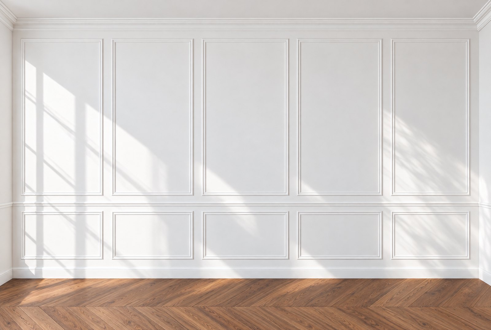
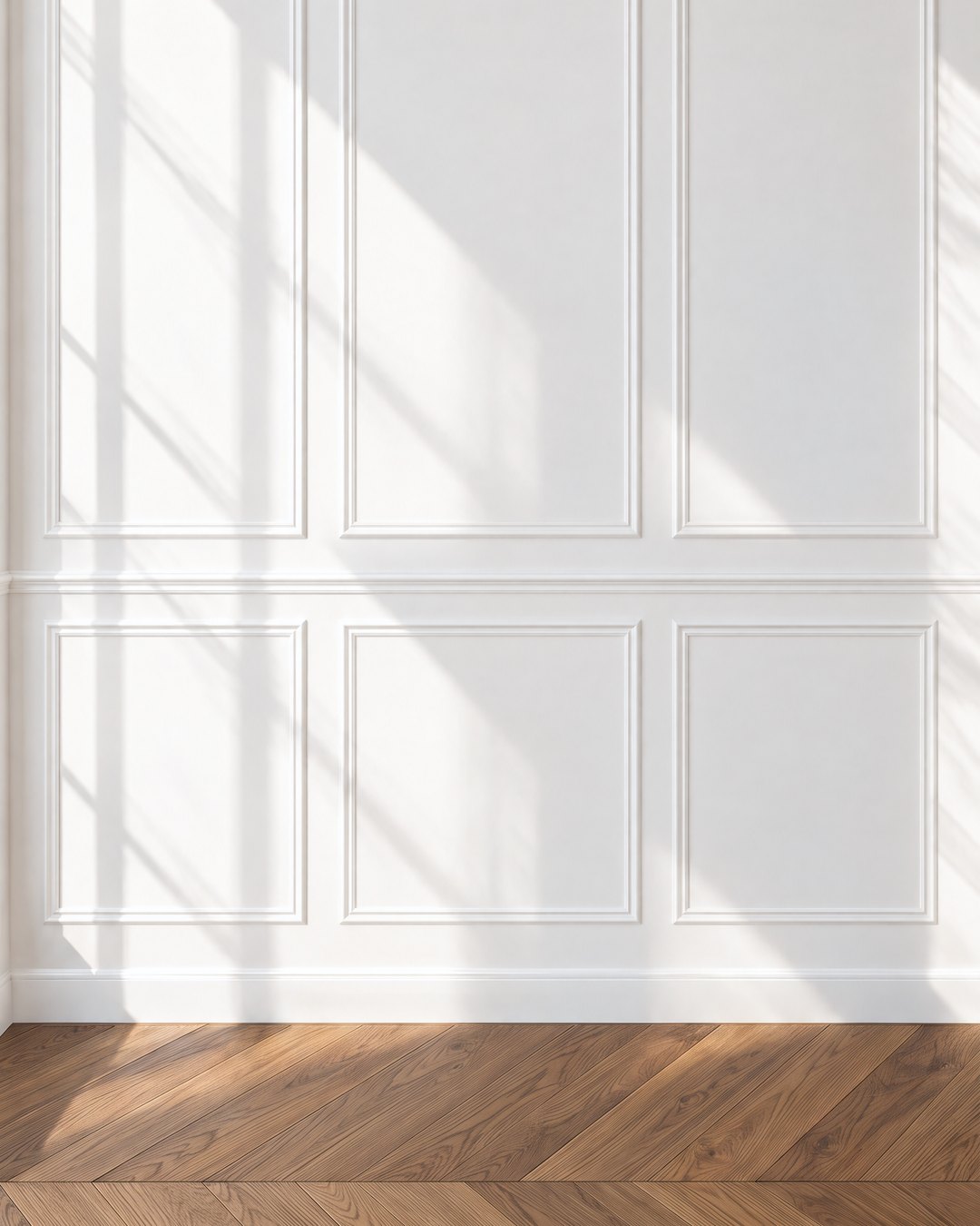
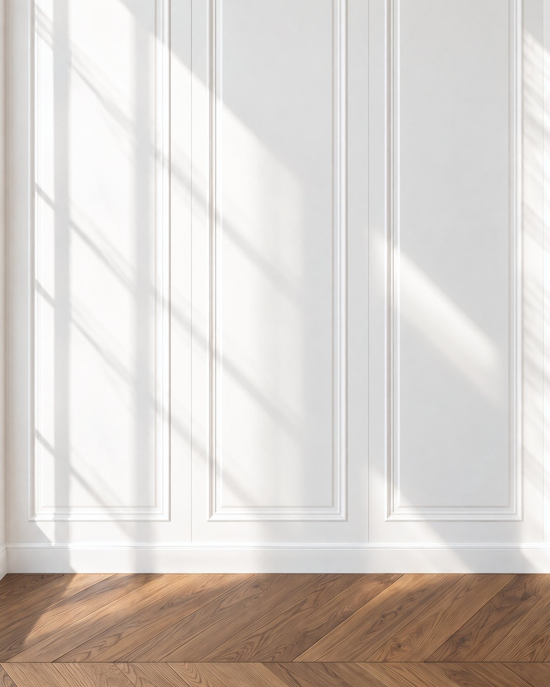
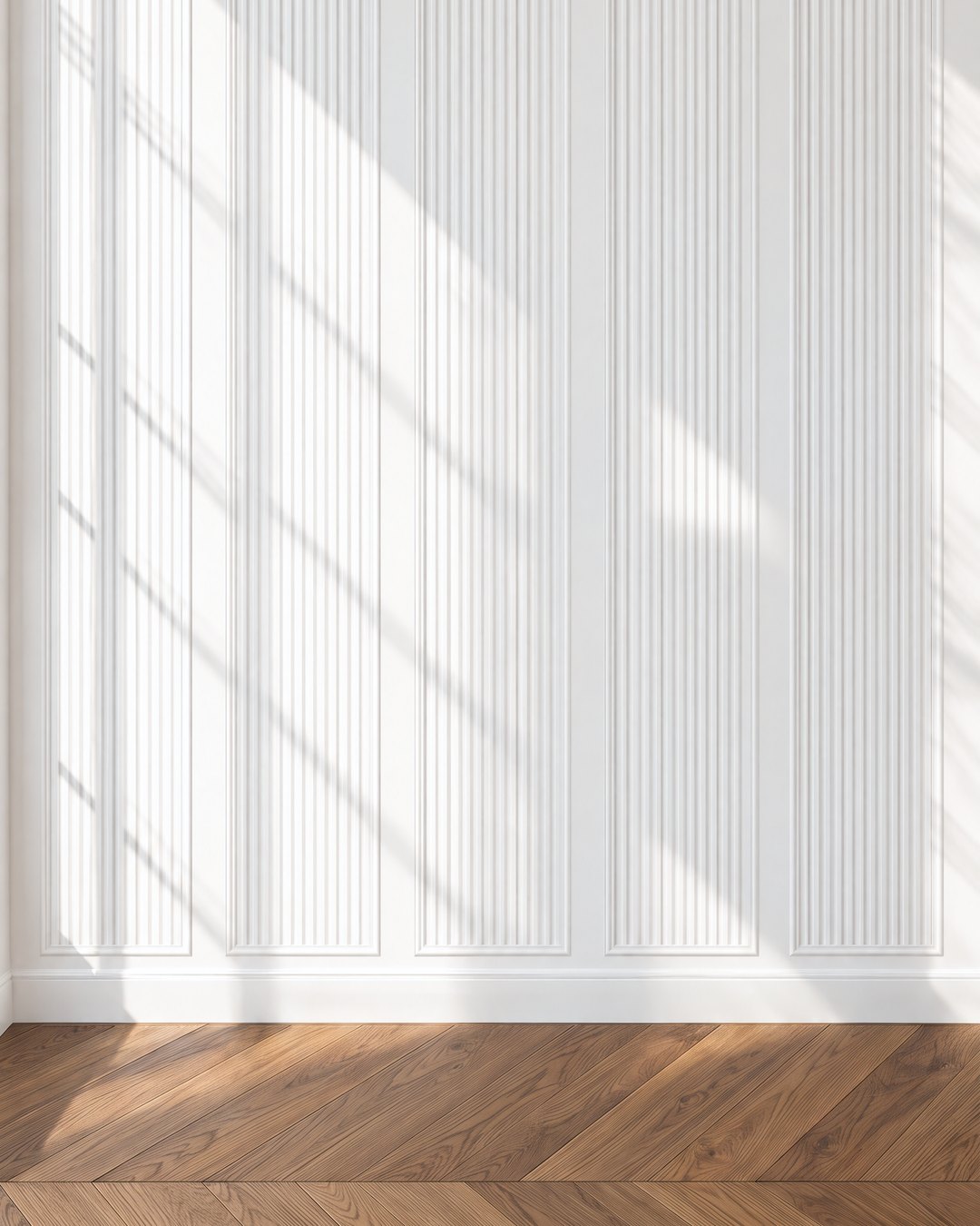
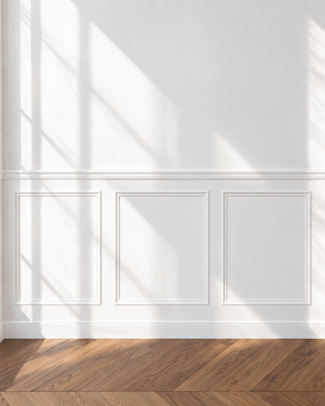
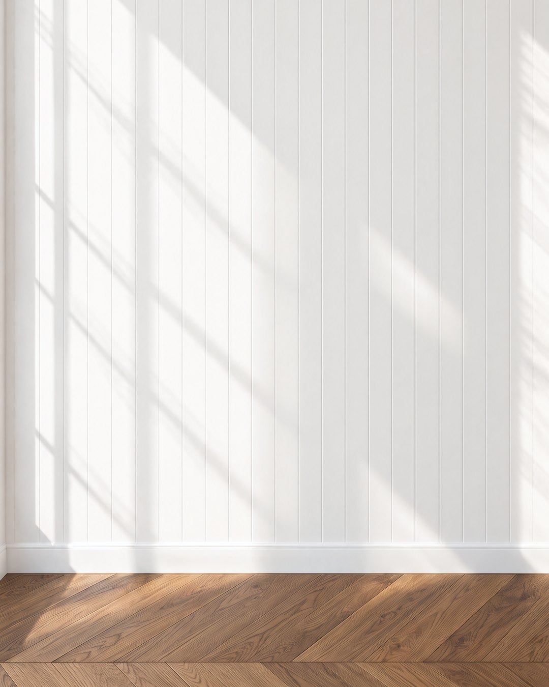
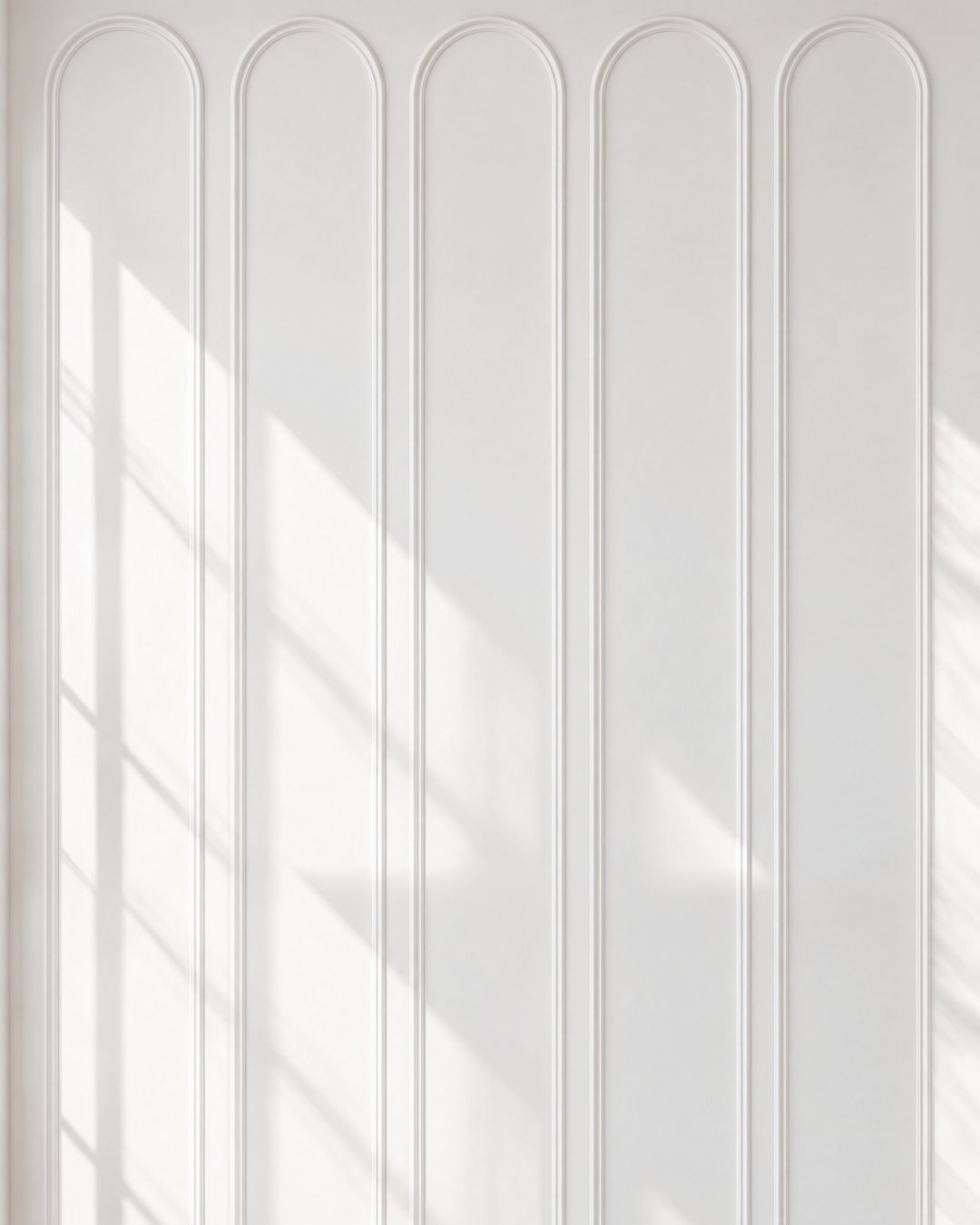
In the images here the room stays the same, with the same chevron floor, the same light and the same wall painted in Simply White by Benjamin Moore, and only the moulding changes, so you can see how much each style alters the character of a space.
Why moulding works
Moulding works because of shadow. Every raised edge catches the light from a window and throws a fine line of shade beside it, and those lines give the eye something to follow across the wall. Painted in the same colour as the wall, the moulding adds depth and texture while the room stays light and calm, which is why I almost always keep them in one colour and let the shadows do the work.
Getting the proportions right
Proportion matters more than the profile you choose. For anything that stops part way up the wall, the classic rule is to place the chair rail at about one third of the wall height, which in most rooms falls somewhere between 80 and 90 centimetres from the floor. The one placement to avoid is halfway up the wall, which cuts the room in two and makes the ceiling feel lower. When in doubt, go slightly smaller, since a moulding that is a little under scale always looks better than one that is too heavy. The gaps between panels look most balanced at around 8 to 12 centimetres, and the chair rail should read a little stronger than the panel moulding beneath it.
Six ways to dress a plain wall
Picture frame moulding is the classic: slim applied frames above and below a chair rail, set out symmetrically across the wall. It suits almost every room, from a hallway to a bedroom, and it is the easiest way to give a new build apartment the feel of an older house.
Full height panelling runs tall raised panels from the skirting to the cornice. The long vertical lines draw the eye upward, so the ceiling feels higher and the room more formal, which makes it lovely in a dining room or a study.
Fluted panels set fine vertical flutes inside slim frames. As the light moves across the day, each flute catches it differently, so the wall gains texture in its own colour. It is a modern take on panelling and works beautifully behind a bed or a console.
Classic wainscoting covers the lower third of the wall with raised panels under a moulded rail. It is practical as well as handsome, protecting the wall where chairs, bags and small hands meet it, which is why it belongs in hallways, dining rooms and children's rooms.
Tongue and groove clads the wall in narrow vertical boards with a fine groove between them. It has a relaxed, easy character, and painted in a soft white it is lovely in a bathroom, a boot room or a country style kitchen.
Arched panels are tall frames with rounded tops. The curve softens a flat wall and brings a sense of architecture to a room that has none, and they look especially good at the end of a corridor or flanking a doorway.
How I decide
I start with the ceiling height and the way the room is used. In a room with a modest ceiling I lean toward full height panelling or tall arched frames, which lift the eye, and I keep wainscoting low and slim. In a hallway or dining room that takes daily knocks, wainscoting or tongue and groove earns its place. Then I look at the furniture that will stand against the wall, because the moulding should frame a bed, a sideboard or a piece of art, and every panel line should land where it makes sense for what sits in front of it.
The images in this article are design visualisations by Studio Sakaia.